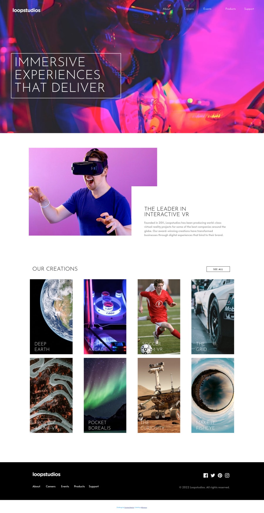
Design comparison
Community feedback
- @grace-snowPosted over 2 years ago
Hello
Sorry for the delay. I hope this feedback is helpful
- Attribution must also be in a landmark element. Place it in a footer not div, then add aria-labels to each of the footers on the page
loopstudioson the challenge footer andchallenge attributionon the other footer - There's no reason to make the body a flex container I think, nor is there a reason to have 'grid-container'. You don't need either because the landmarks would stack by default anyway. There is no reason for the min-width. Generally you are just over-using and over-complicating this by adding grids at just about every layer
- Now the really important stuff... This is not how you make a mobile nav. As well as the alignment being wrong because of the unnecessary grid columns using %, you have event listeners on non interactive elements. This should never happen! The correct way to do a mobile nav (called a disclosure pattern) is a button inside the nav before the list of links you're going to toggle. That button can have the hamburger and close images inside, but you need to accessibly label that button. So have empty alt on the img tags and then use either visually-hidden text inside the button, or aria-label on the button. The button also needs an aria-expanded attribute that toggles between false and true on click. Straight after this button should be the list of links and these must be in a list element. Again, the list of links dont need to be a grid on mobile. That's over-engineering. In a real site, the number of nav items would change depending on content - you never want to explicitly place everything on a grid
- javaScript should not be used to change inline styles on this menu. Instead, keep styling to CSS an use JS to toggle classes or attributes only.
- In the heading elements, don't capitalise in the html. Let CSS do that
Image interactiveis not good alt text. Alt on a meaningful image must describe what the image looks like, and should noty include words like 'image' because it's already an image element- Article is not appropriate for the first chunk of content on the page. Article is for content that would be syndicated across other sites or locations. This content is very specific to this web page.
- You are using padding and margin in inconsistent ways. Padding is for internal spacing. So you use that on boxes or elements that have other content inside to create space from box edges. You wouldn't use it on elements like paragraphs. Margin is for external spacing - keeping elements apart from each other. You would use that on paragraphs
- If the images have hover effects, that means they're interactive. I'd expect each of these to include an anchor tag and that have the
:hoverstyle hook - The hover style is not right on this. I think the original design makes the image darker but the text should remain visible. You could do that with a pseudo element or blend modes on the images, not by changing the text color. It becomes unreadable at the moment. You should not need any JS mouse events - just use the correct html and you would have :hover available in CSS by default. Only ever use JS when you really need to
- It's odd that you're using grid on those image boxes as well, but not using that to lay out the text
- Logo alt should not say
logo icon. It needs to say the same text as the logo - say what the site is called. If that logo is also in an anchor link, it should say the link destination in the link label, e.g.aria-label="Home - Loopstudios - The footer should have a nav element. As there would then be two navs on the page, both should be labelled eg
mainandfooter - Same as the logo link for the social links. They should not say 'icon' and should say where the link goes to. In this case, just the name of the platform is fine as a link label
Overall:
Open dev tools on the side of your browser and shrink the viewport down to 320px wide. Watch what happens. You can also use the browsers emulation tools and test on small phones portrait and landscape (e.g. iphone SE/5). You can also zoom in/out; or change your default browser font size...
See how content overflows the screen. This is probably caused by all the nested grids but hard to isolate one specific cause because of the complexity in this.
I would strip back as much as you can. Focus on HTML first, then comment out / hide all content and work through each component in turn. Only use grid if you need to lay out children along two axis at the same time. Resize the viewport often, including using zoom +/-. See how simple you can make it. Then uncomment the next section of content and do the same...
This process will be really helpful to unlock a deep understanding of layout
Marked as helpful0@DarionasPosted over 2 years ago@grace-snow It is never to late. I very appreciate that you take time to evaluate my work. I know that you did it with love. Thank you.
0@DarionasPosted over 2 years agoHei @Grace. I have capitalized div element, I guess that should be done by css as with headings as well.
1 - Attribution must also be in a landmark element. Place it in a footer not div, then add aria-labels to each of the footers on the page
Please log in to post a comment
Log in with GitHubJoin our Discord community
Join thousands of Frontend Mentor community members taking the challenges, sharing resources, helping each other, and chatting about all things front-end!
Join our Discord
