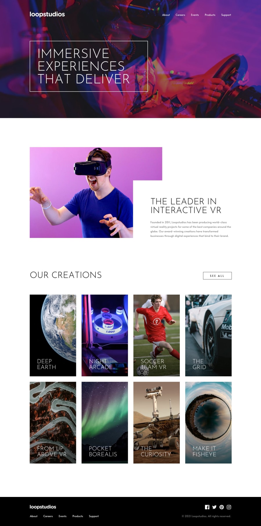
Design comparison
SolutionDesign
Solution retrospective
Feedback is welcomed
Community feedback
- @sirriahPosted almost 4 years ago
Hello, it is amazing work! I see only some details missing.
- If you look on the design image, you can see that hero image in desktop design is darker - it has some dark overlay or opacity.
- The image menu in "our creation" section has a gradient under the text for better readability.
- I am not sure that is the best practise to put br tag into the h4 for break the line of headline in image menu. There is no break in mobile view on design image.
- hero image doesn't work properly for screen under 768px - the headline overflow to the right side which has white background. Have a nice day, I look forward to you next design.
1@ubong-sPosted almost 4 years ago@sirriah Thanks for the feedback. I've made the corrections. About bullet point 3, The is a break in the h4 on mobile view. It's in the design image
0 - @ArshKarpoorPosted almost 4 years ago
Wow!
1
Please log in to post a comment
Log in with GitHubJoin our Discord community
Join thousands of Frontend Mentor community members taking the challenges, sharing resources, helping each other, and chatting about all things front-end!
Join our Discord
