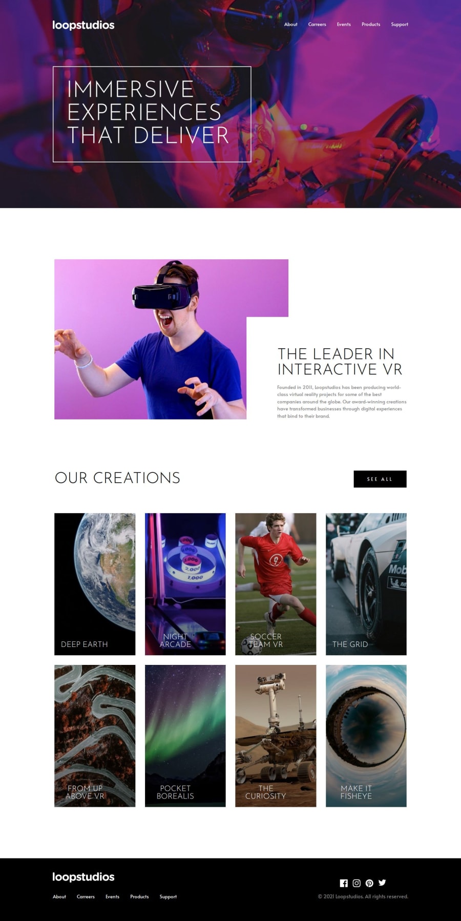


Design comparison

Solution retrospective
Some best practice advice for using sass. I experimented with nesting selectors, but not a big fan of it, feels like it's harder to see through the style-system, than with proper naming and no nesting.
Other question is the @media usage: Dou you like to write a whole block for media-queries, or write them for each selector seperately (like I did here)? I'm not sure wich is better, maybe a whole @media block is cleaner..
Feel free to criticise anything, It makes me think ;) Cheers
Community feedback
- @Ayah2022Posted about 1 month ago
social media icons need to be justified flex-end i have the same issue u had in your footer (a space at its bottom),still hasn't solved it yet :`) Great work , keep going!
0

Please log in to post a comment
Log in with GitHubJoin our Discord community
Join thousands of Frontend Mentor community members taking the challenges, sharing resources, helping each other, and chatting about all things front-end!
Join our Discord