Design comparison
Solution retrospective
Please tell me how I can improve
Community feedback
- P@BurritoDoggiePosted about 4 years ago
hello Naglaa,
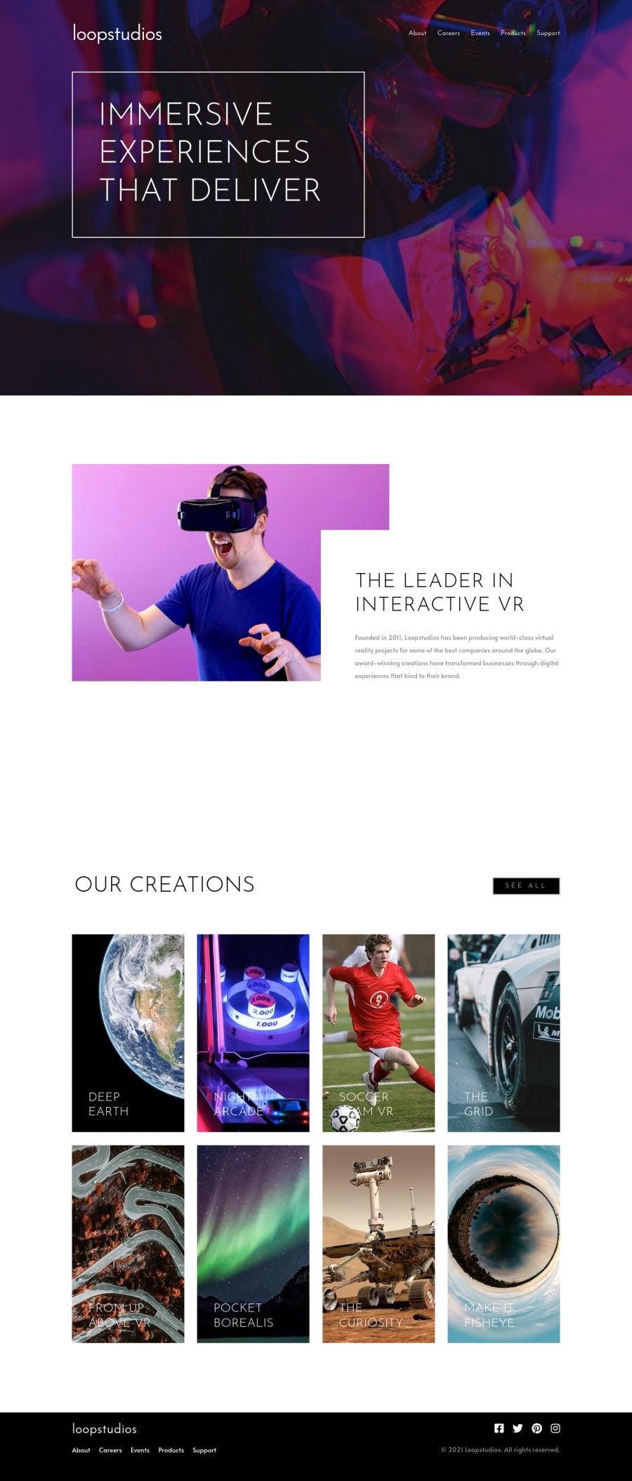
Great job! I really like that whenever you mouse hovers over the pictures it changes the text of the other pictures.
note: you inverted the colors of the 'see all' button. If it was on purpose cool but if not I think you should change it. I don't really care I just noticed it.
keep Coding!
                                           (@@)
                                            \__/
2 - @steventobenPosted about 4 years ago
I would recommend not setting each section's height to be the size of the viewport. It's best to let it be based on the size of it's content, such as the size of an image. In the white box on the second section containing the heading and paragraph I would suggest adding some padding to the bottom of the box, at certain sizes there is a gap where the picture is showing through because the box is too short. I'm not sure if you noticed this but when you hover on an image in a row on the last section, all of the text in that row changes color, not just the hovered one.
I would suggest putting the heading for each section as a direct child of your section elements, as this is how section should be used semantically.
The last thing is I would suggest taking a look at your stylesheet. Try to avoid nesting more than 3 levels deep, this can cause extremely long stylesheets to be generated when your sass is converted to css. I'd also suggest purging your icons stylesheet, there's thousands of icons but you only need a few so that would free up a lot of overhead.
Overall I'd say it looks nice, good job on this big challenge!
1 - Account deleted
Hello Naglaa! 👋
Nice work on this challenge.
Regarding the issues on your solution report, you can try adding an aria-label to both 'section' and 'a' tags. I had the same issues and it worked for me.
Hope it helps :)
0 - @steventobenPosted about 4 years ago
I would recommend not setting each section's height to be the size of the viewport. It's best to let it be based on the size of it's content, such as the size of an image. In the white box on the second section containing the heading and paragraph I would suggest adding some padding to the bottom of the box, at certain sizes there is a gap where the picture is showing through because the box is too short. I'm not sure if you noticed this but when you hover on an image in a row on the last section, all of the text in that row changes color, not just the hovered one.
I would suggest putting the heading for each section as a direct child of your section elements, as this is how section should be used semantically.
The last thing is I would suggest taking a look at your stylesheet. Try to avoid nesting more than 3 levels deep, this can cause extremely long stylesheets to be generated when your sass is converted to css. I'd also suggest purging your icons stylesheet, there's thousands of icons but you only need a few so that would free up a lot of overhead.
Overall I'd say it looks nice, good job on this big challenge!
0
Please log in to post a comment
Log in with GitHubJoin our Discord community
Join thousands of Frontend Mentor community members taking the challenges, sharing resources, helping each other, and chatting about all things front-end!
Join our Discord
