Design comparison
Solution retrospective
Hey guys!
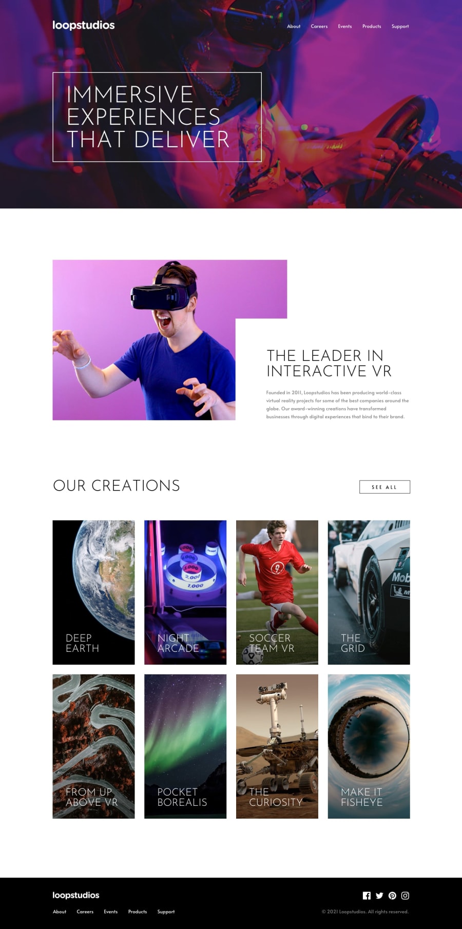
I would be very reconizing if you could check my responsive and give me some feedback :D
I got just very difficult to make de text inside the images (for desktop) with an opacity 100% with a black color when the hover on the images is active.. I'm listening to a solution for that :)
Thanks for watching my challenge !
Community feedback
- @grace-snowPosted over 3 years ago
Hi,
Just had a look on my phone and this looks excellent. You've done a really nice job.
Where you definitely need to make improvements is in making your solution accessible
- add aria-labels to the open/close buttons for the nav
- add meaningful alt text to the logo image whenever it is included (logo does not tell me what the product/site is called, it needs to be the name)
- see all buttons should actually be anchor tags not button elements, as they would be performing navigation
- footer nav needs an aria label (
footeris a fine value for this) - social icons need wrapping in anchor tags
- all interactive elements on the page need a visible focus style so people navigating by keyboard can see where they are.
Enjoy the tips and keep going, you're doing very well
1@AllanguiPosted over 3 years ago@grace-snow
Hello Grace , thank you for you feedback i really appreciate ! I changed what you told me that was wrong.
Big thanks !
0 - @shub78910Posted over 3 years ago
Damn, that's some good shit! Keep up!
0
Please log in to post a comment
Log in with GitHubJoin our Discord community
Join thousands of Frontend Mentor community members taking the challenges, sharing resources, helping each other, and chatting about all things front-end!
Join our Discord
