Design comparison
SolutionDesign
Solution retrospective
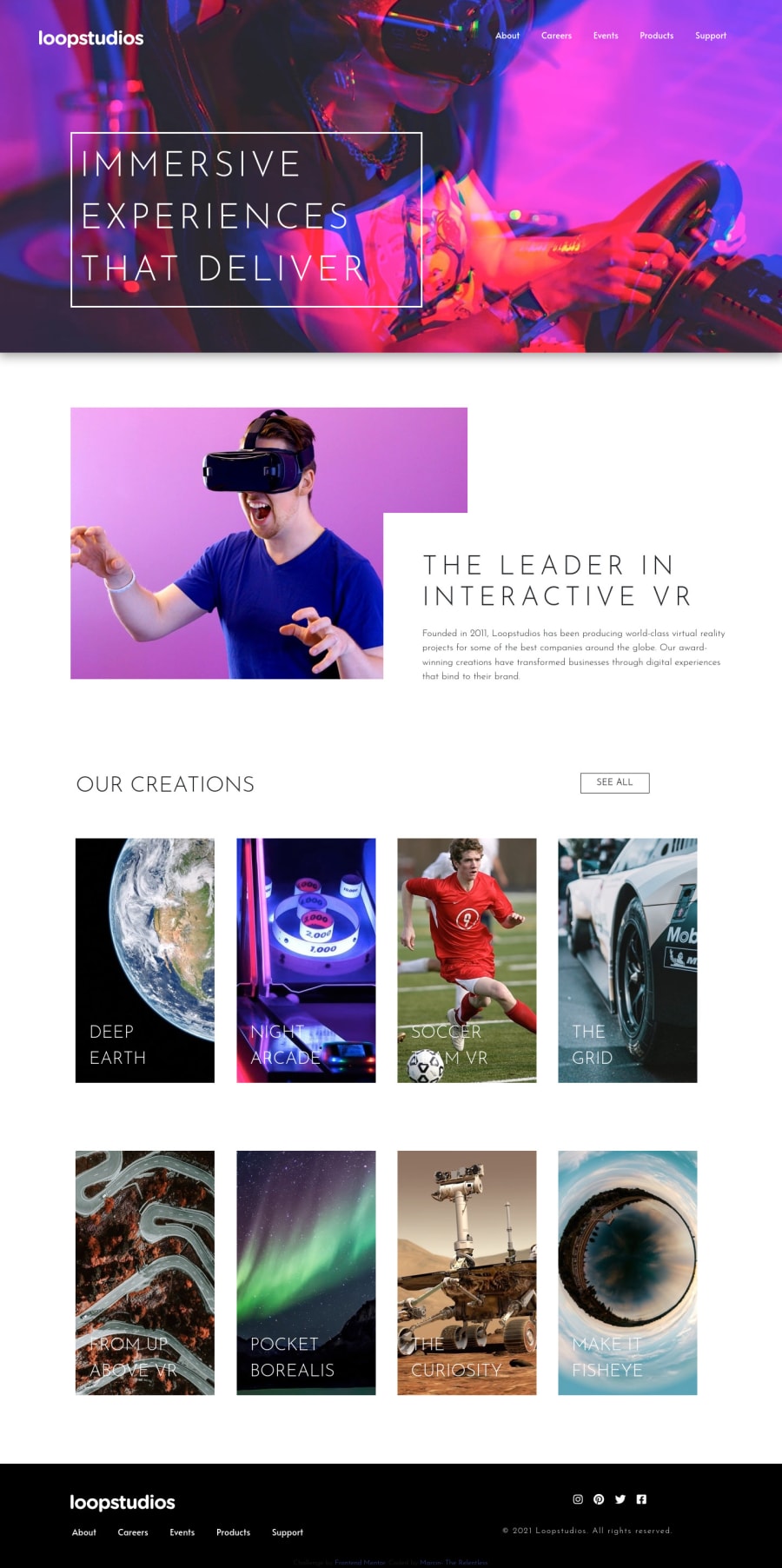
Hi all. I borrowed some js code for the offcanvas menu and I know it doesn't look how it is meant to but I really struggled with this aspect of the project. I also struggled with the correct padding and sizing for screen above 1440px as the challenge was based on this resolution. A huge struggle with the footer on the mobile view so I'd appreciate any feedback for some obvious stuff that I missed and made my code so unnecessary long and not clear. As for the menu items, I couldn't figure out how to shorten the underline for each active item of the menu so would appreciate a tip there too.
Community feedback
Please log in to post a comment
Log in with GitHubJoin our Discord community
Join thousands of Frontend Mentor community members taking the challenges, sharing resources, helping each other, and chatting about all things front-end!
Join our Discord
