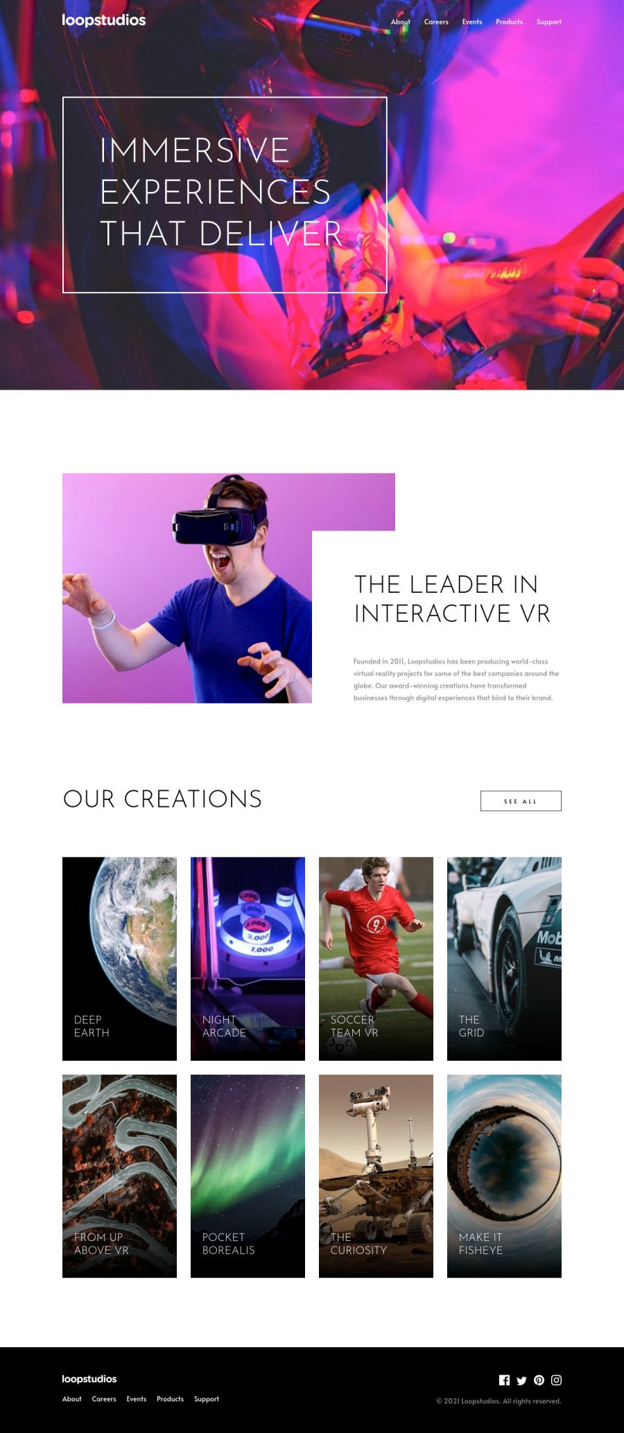
Loop Studios landing page, Sass, grid, some JS for mobile menu
Design comparison
Solution retrospective
This is my first submission in about a year. I'm looking to update my portfolio. It's been interesting looking back at my older projects, comparing and seeing how much I've grown in a year. Having said that, as I'm sure we all know, there's always room for improvement, so if anyone has any tips or suggestions for improvement, please let me know.
Besides the 'Our Creations' section, I used grid on the 'Leader in Interactive' section to achieve the overlapping of the copy over the image. I've used this process before, but had to go back and look it up again.
I feel like my Sass/css organization could be cleaner. At my job, we use @import in order to use separate scss files, but I've seen that Sass is recommending we don't use @import anymore and are moving to @use. Curious what other people are using.
Community feedback
Please log in to post a comment
Log in with GitHubJoin our Discord community
Join thousands of Frontend Mentor community members taking the challenges, sharing resources, helping each other, and chatting about all things front-end!
Join our Discord
