
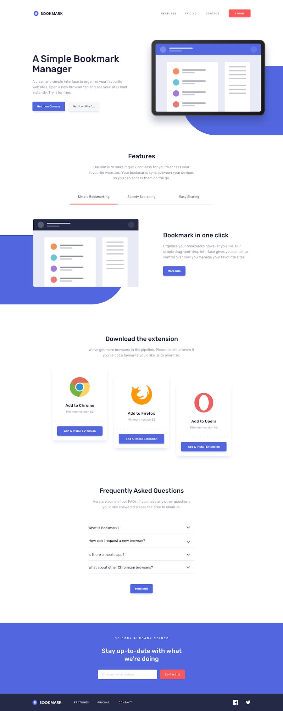
Looooooooooooong bookmark landing page using Tailwind CSS


Design comparison
Solution retrospective
That I did my first intermediate challange all by myself and its not even the easiest one in my opinion!! It's not done yet, but I'll comeback to it after I end the learning path and the tutorial of this challange :)
What challenges did you encounter, and how did you overcome them?Organising and keeping everything in place(especially the relative/absolute objects)
What specific areas of your project would you like help with?Any advice in keeping everything in place and other stuff that you may consider helpful for a learner to become pro at frontend development! Thanks in advance! 😊
Community feedback
- @Deeperr0Posted 3 months ago
Positioning and Styling the Soft Blue Div
First of all, great job on completing the task! I see that you had some difficulty positioning the soft blue div behind the image. Here are some key points to help you:
Understanding
position: absoluteThe
position: absoluteproperty positions an element relative to its nearest positioned ancestor. If the ancestor does not haveposition: relative(or another position value), the element will be positioned relative to the initial containing block. Usingposition: relativeon the ancestor is often the easiest approach as it doesn't affect the flow of the document.Positioning Tips
You used
bottomandleftproperties to position the element. However, positioning it from the bottom-right might be more straightforward.border-radiusBasicsThe
border-radiusproperty can be used to round corners of an element. Here’s how it works:- One value:
border-radius: 8px;applies a radius of 8px to all four corners. - Two values:
border-radius: 8px 4px;applies 8px to the top-left and bottom-right corners, and 4px to the top-right and bottom-left corners. - Three values:
border-radius: 8px 6px 4px;applies 8px to the top-left, 6px to the top-right and bottom-left, and 4px to the bottom-right corner.
The values follow a clockwise order starting from the top-left corner:
border-radius: top-left top-right bottom-right bottom-left;.Making the Div Rounded
To achieve a fully rounded appearance on the left side of the soft blue div:
- Set the
border-radiusfor the top-left and bottom-left corners to a very large value (Think 1000px). - For example:
border-radius: 1000px 0 0 1000px;.
This will make the left side of the div completely rounded. Apply the same technique to the other soft blue div in the features section.
Your soft-blue class css would look something like this in the end for it to be positioned properly. I am not sure of its responsiveness but use it as a guide
@media (min-width: 63em) {
    .main__part1 .soft-blue {
        background-color: var(--Soft-blue);
        border: .125rem solid var(--Soft-blue);
        border-radius: 1000px 0 0 1000px;
        bottom: 0;
        display: flex;
        height: calc(15rem + 4vw);
        right: 0;
        margin-bottom: -11.25rem;
        position: absolute;
        width: 50%;
        z-index: -1;
        margin-left: 10%;
    }
}
Marked as helpful1@sksksk2024Posted 3 months agoSolid advice and thanks, @Deeperr0 !! I'll try them out asap!🔥👍
0 - One value:

Please log in to post a comment
Log in with GitHub
Join our Discord community
Join thousands of Frontend Mentor community members taking the challenges, sharing resources, helping each other, and chatting about all things front-end!
Join our Discord