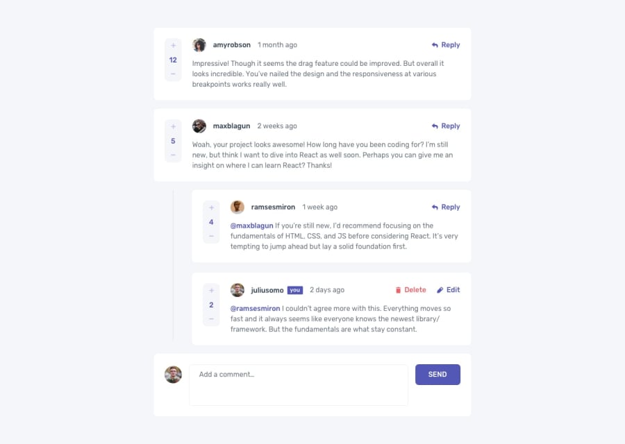
Design comparison
SolutionDesign
Solution retrospective
My CSS still sucks but I'll bet on my JS skills any day!
I did it how I wanted. I'll give myself 80/100 in this cause I had to compromise twice and the problem was nothing but positioning else, I'd score myself 100/100.
the line running through replies was impossible for me and the ratings div won't stay below the words of comments or replies in mobile design so I left it with the position it was in the desktop design.
I'll welcome all suggestion to solving those two issues so I can score myself 100/100. Other than those, I rocked this stressful project like a summer shade.
Community feedback
Please log in to post a comment
Log in with GitHubJoin our Discord community
Join thousands of Frontend Mentor community members taking the challenges, sharing resources, helping each other, and chatting about all things front-end!
Join our Discord
