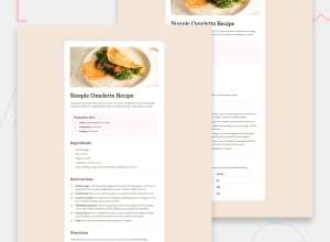
Design comparison
Solution retrospective
Most proud of learning about list styling and how tricky it can be. Fairly happy with how well my solution resembles the design. Next time I'll be better prepared based on the experience I've gained from this challenge.
What challenges did you encounter, and how did you overcome them?Styling ordered and unordered lists, and there markers. My online research first showed me I needed to remove the bullet marker and create my own to properly replicate some styles, or simply style the marker that was there. If I wasn't able to style the marker directly, then I deployed flexbox and created a marker in the html using the unicode representation. This was due to the marker not centering with the list that was wrapping to different lines.
What specific areas of your project would you like help with?The numbers for the Outfit font didn't match the design. I'm not sure why. I'm not sure the approach FEM expected me to use to style the list. The removal and recreation of bullet points using list-style-display: none; or direct styling of li::marker?
Community feedback
- @neildeoPosted 12 months ago
This is a great piece of work which matches the design almost exactly, well done! Brilliant spot to notice that the bullet points in the Preparation section should be centred, and great job getting that to work, I did not notice that at all when doing the challenge myself.
There are some easy points to improve to get a better visual match: some of the font weights are too heavy (800 instead of 700; you actually defined variables for font weights but haven't used them!), and the h1 should be the darkest grey colour.
One other thing to maybe focus on in the future is making sure the design looks good at a range of sizes: while this solution is a near perfect match at the specified screen widths, it doesn't resize well for intermediate sizes (or sizes below 350px, which I think exist on some folding phones now?). One way to get around this is to set the container width to 100% for smaller screens using a media query, instead of specifying a pixel width.
Finally, I also got frustrated by the number 1 not matching the design. I think it's something to do with the font design at different weights but I could be wrong. In any case, I just made peace with it for this challenge. In the real world, if it bugged me enough I would just use a different font!
To conclude, again great job on the list (and table) styling, it's really clean and your code is nice as well. The semantics of the HTML are strong and the code is well organised. Keep it up!
Marked as helpful0
Please log in to post a comment
Log in with GitHubJoin our Discord community
Join thousands of Frontend Mentor community members taking the challenges, sharing resources, helping each other, and chatting about all things front-end!
Join our Discord
