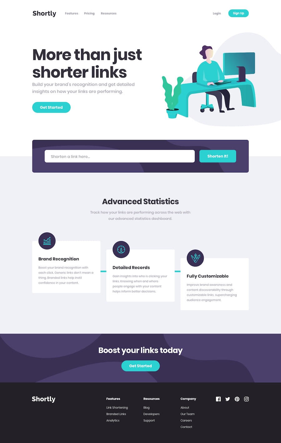
Design comparison
Solution retrospective
This took a lot longer than I expected. However, I learnt a lot. I still need to implement where the links stay when the site reloaded Questions: -Any advice how to get the green bars? I am going to keep working on it.
Thank you!
Community feedback
- @Ibarra11Posted over 2 years ago
From looking at the design, in my opinion the best approach would be to target the middle card and use the :before and :after pseudo selector on it. They are pretty much the same, so it would require one declaration. For example, it would be something like this .detaild:before, .detaied:after{ the css would go in here}. You want to ensure that you gave the detailed card a position of relative and the pseudo-selectors absolute, so you can position relative to the detailed card.
Marked as helpful1
Please log in to post a comment
Log in with GitHubJoin our Discord community
Join thousands of Frontend Mentor community members taking the challenges, sharing resources, helping each other, and chatting about all things front-end!
Join our Discord
