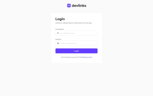
Link Sharing App | Next.js | Typescript | Tailwind

Solution retrospective
Hi!! This is my 27th challenge here at FEM and a long overdue one, again.
It's really nice to do a challenge once again and completing it. There's a lot of things happened this previous months and one main is that I had a job as a dev. That's why I was not active again but I think I could be active again now^^.
This challenge was again really fun building it and I built it with the new app router. I know i'm late with this new router and that's why I am not really satisfied on how I structured the codebase and if I used those new things correctly.
For this, I used mysql for the database with drizzle as the ORM. Both are new to me, though I did have experience using mysql with my previous work but only with another ORM and not really natively, that is why I really want to learn it and I found drizzle is really close with how you write it manually and could also inject with sql queries directly!! Really cool!!
I also added logout button even though there is none inside the mockup, I just thought that how will the user change account.
For the user's information, I made the email not changeable for now. Maybe will change if I could think a better approach for this.
The most challenging part on this is finding a database hosting that is free and I really spend lot of time, trying different codes in order to make the connection as limited as possible so that the maximum connections of the hosting that I used won't cause any error. Though this still came up in the end and thankfully I found other hosting with much flexibility while also being free.
Right now, I don't know if the app produces bugs or not, but visually, when you switch the tabs like from links to profile , if you make your cursor stay on the link while clicking it, you will find a animation bug on the opposite side. This didn't occur when I made the header in a regular component that is called normally in another, this only appeared when I made use of layout that includes this header inside.
There are lots of improvements that could be done for the app, but I'm just glad that I finished this one out.
Thanks for checking it out!!!
Please log in to post a comment
Log in with GitHubCommunity feedback
No feedback yet. Be the first to give feedback on Raymart Pamplona's solution.
Join our Discord community
Join thousands of Frontend Mentor community members taking the challenges, sharing resources, helping each other, and chatting about all things front-end!
Join our Discord