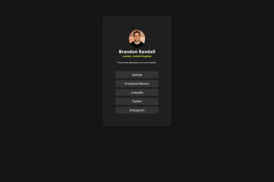
Design comparison
Solution retrospective
i was proud of me making this kind of near to the original.
What challenges did you encounter, and how did you overcome them?My challenge was the redirection to the links.
What specific areas of your project would you like help with?Any feedback and help will be welcomed.
Community feedback
- P@Artiom-DeyevPosted 12 months ago
The HTML is very good. Maybe it's a good practice to add some comments for a better readability, but the project is small so there's no big need for this.
The layout look good.
The solution doesn't differ much from the desing. The font is slightly lighter in the links, and in the caption in general a little smaller then in the design (but this is me nitpicking).
Other then that it looks very god.
Marked as helpful0
Please log in to post a comment
Log in with GitHubJoin our Discord community
Join thousands of Frontend Mentor community members taking the challenges, sharing resources, helping each other, and chatting about all things front-end!
Join our Discord
