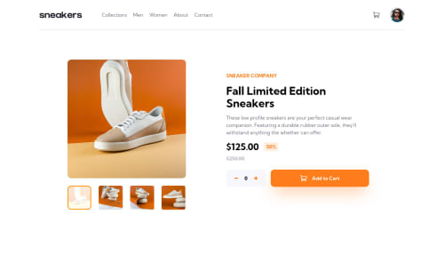
Lightbox Product Page using ReactJS and Tailwind css

Solution retrospective
I found it difficult to develop the overlay part for the lightbox. I used the filter property and I didn't know it affected the position property in that it creates a new containing block! I am unsure about the code that specifies the sizes of images and their containers, I feel that I may have done it inefficiently! For best practices, I wanted to know in react, what component to reuse, for in the beginning of the project I made a single component of a type for example, the BigImage, to be used for both mobile and desktop layouts but it made working with the single component and the various conditions that followed difficult. I ended up making the same component for both mobile and desktop, which forced me to repeat some code in jsx and css :(
Please log in to post a comment
Log in with GitHubCommunity feedback
No feedback yet. Be the first to give feedback on Reuben Barboza's solution.
Join our Discord community
Join thousands of Frontend Mentor community members taking the challenges, sharing resources, helping each other, and chatting about all things front-end!
Join our Discord