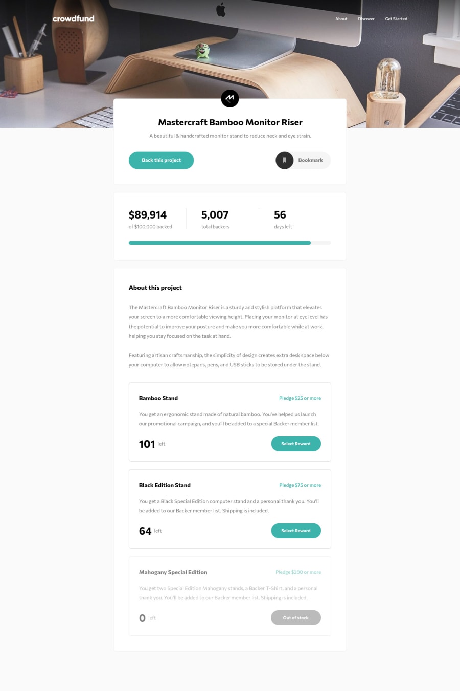
Design comparison
Solution retrospective
Hello! Today I learned about Vuex, in order to deal with global state management.
At the moment the user can enter under the minimum pledge amount (but not be 0), so I would like to fix this when I next find free time. Also the design does not seem to show the correct percentage for the pledge total? I may have the math wrong though (progressBar.vue), if someone could let me know, that would be appreciated!
Overall this was really fun, and got quite tricky when keeping track of pledges remaining, pledges made, pledge total ect. Learnt a ton though!
Any advice with Vuex (or anything!) is very much welcome
Community feedback
- @P4P1-NDPosted almost 3 years ago
Hello @BenjaDotMin, congratulations for this challenge, the user experience is great. I looked at the math for the progress bar and I don't think there is a problem. The only suggestion I have is that you could change the computed value from
this.$store.state.backedFundsto(this.$store.state.backedFunds / 100000) * 100(or simplify it to(this.$store.state.backedFunds / 1000)). You could also create a getter for this in the store. Overall you did a great job 👍Marked as helpful1@BenjaDotMinPosted almost 3 years ago@P4P1-ND Thank you for the pointers! I am still getting my head around the getters{} and modules{} sections of Vuex, so that definitely helps :)
0
Please log in to post a comment
Log in with GitHubJoin our Discord community
Join thousands of Frontend Mentor community members taking the challenges, sharing resources, helping each other, and chatting about all things front-end!
Join our Discord
