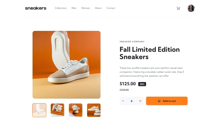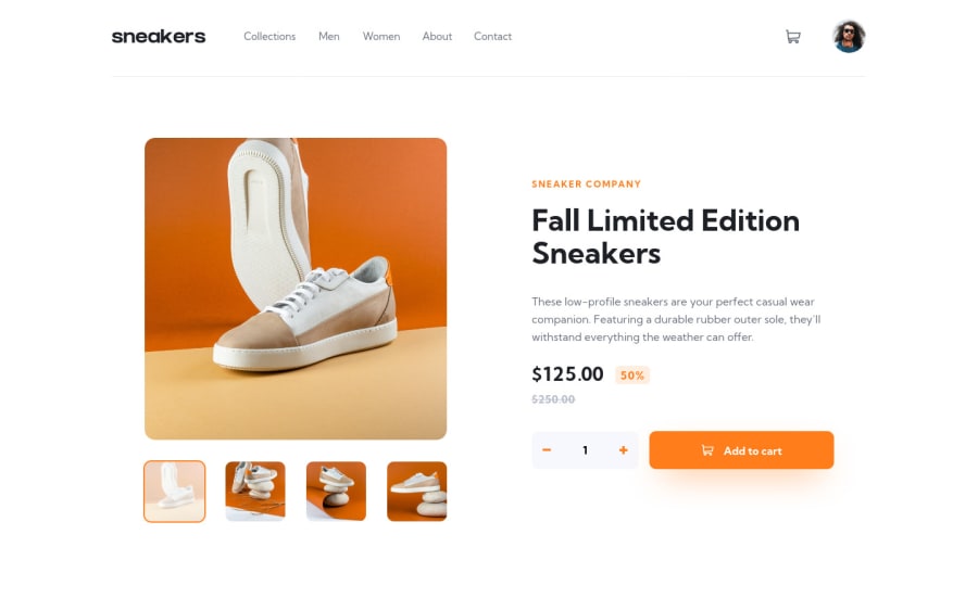
Design comparison
Solution retrospective
Hello all! Today I learned about managing global state, using React and Redux. As always, pointers are welcome!
Thanks very much.
Community feedback
- @grizhlieCodesPosted almost 3 years ago
Awesome stuff man, love how close you got with the final result. Must have been satisfying when you saw that generated screenshot comparison 😁
I don't have much feedback in terms of code but here's an idea regarding accessibility:
- If you click on the cart you currently have to click on it again to close it.
- Implement a listener + function that closes the checkout when the user clicks the 'Escape' key.
- Also if the user clicks on anything that is not the cart, whilst the cart is open. Easy to do with another global listener (perhaps one that's created and destroyed depending on cart state) and
closest
link.
A few pet peeves
-
header
is located inmain
, any reason for putting it in main instead of thebody
or rather the container that you work with in React? I use Sveltekit but looks like similar concepts apply, some div or whatnot that acts likebody
. -
I personally avoid using fixed heights. Any reason to use it for the
header
? I usually build any height I need based on the content + gaps + paddings etc. -
Did you build the carousel? Wondering why it doesn't just loop when you reach the last/first image and then continue clicking in the same direction. Eg.: If we're on the first image and click
previous
it doesn't go to the last image. I'm only asking because I recently tried building it from scratch along with the transitions etc 😅
Awesome job though. Managing global state is when you start seeing the possibilities I think, I sure did.
Marked as helpful2@BenjaDotMinPosted almost 3 years ago@grizhlieCodes Thank you so much! I appreciated the input :) I definitely have a weakness in the accessibility department, so everything there is very helpful! Yep you do have a point, I think that's just a simple mistake I made really early on, and got distracted by the design and shiny things, and never went back. My mistake! But I was under the impression header/footer can be used in any context? For example a sidebar can have its own header/footer, screen readers don't need them to be in specifically only in body etc. As I say, syntax and structure is a part I am still looking to improve on.
As for the height, nope, no reason for a set height, it just worked so ran with it haha, everything stayed the same until mobile, so saw no reason to mess with it :)
Regarding the carousel, nope I used a library for the carousel, and was a choice to make it not loop. I could easily add the option to make it loop in the options. The main focus of this little project was to focus on learning global state, how to toggle, access, read state and the like. So I did not want to get bogged down with a carousel haha, I hope that makes sense. I think if I were to build my own carousel, I would try to isolate it to another project, so I could quickly reference it in future :)
Yea! It took a while to get my head around actions and reducers, and "decentralising" the data.
Again, thanks for the time you put into looking into this. Appreciate it.
1@grizhlieCodesPosted almost 3 years ago@BenjaDotMin So, header and footer can indeed be used anywhere else. A section can have them, a div even I suppose.
But ultimately whilst that's true semantically I think that this is more of a body header than a main as it doesn't really have anything to do with the main. It would also probably be on other pages if this were a real fully-blown website with multiple pages. That was a nitpick to be honest but overall a normal website would have header -> main -> footer. I think :P
I'm on the sidelines when it comes to libraries. A part of me sees the benefit and the time saved. But on the other hand when you build some stuff you learn things you didn't even know you could learn. The other day I essentially wrote my own version of 'scrollHeight' as the normal scroll height was ignoring a bunch of CSS information that I needed to account for.
Or when I did the invoice app on FEM, I built my own date-picker (that was a f***** mission when I did it the first time). I can't express the amount of lessons in that.
Then again, if I used a library for these things I would have learned how to use that library which could be argued to be a tool also. It's all useful and interesting in the end, hard to pick lol.
How are you finding react? And if you give Svelte a whirl, let me know if anything. I've spent the better part of 2021 with it, might be able to help. React not so much 😅
Marked as helpful1@BenjaDotMinPosted almost 3 years ago@grizhlieCodes Right ok I am with you! Sounds like I need to get the fundamentals down for that stuff, instead of diving head first into redux haha.
Yea I know exactly what you mean about libraries. I was told that if I was to join a web dev agency or something, they would not want me spending days hand rolling a carousel or something similar from scratch, due to tight deadlines. They would prefer if it took 20mins instead, using a library haha. Plus it has the benefit of it being "Battle tested" across all browsers, and tested by many contributors. So you can just focus on what you need to do.
But on the other hand when it comes to personal growth, I absolutely agree with you, get stuck in and figure out what's happening behind the scenes, and you learn a ton of transferable skills! So yea projects such as this, would benefit me writing my own carousel, but I really wanted to zero in on the Redux stuff :)
Reliance on libraries is a BAD idea, but I think if you already understand what's happening under the hood, I think its fine and saves you a ton of testing across mobile devices.
I'm loving react, its my go-to framework at the moment! It just makes so much sense syntactically. Not tried Svelte, but I heard great things and its up and coming. its deffo on the list, so thank you, I may hold you to that!
I have heard Vue is very approachable, especially when it comes to state management. So for my next project I will learn Vue, and try to get a handle on Vuex over the weekend. After that, its Next and Nuxt, then probably Svelte!
1@grizhlieCodesPosted almost 3 years ago@BenjaDotMin I think that's similar to my stance on libraries. I hate bootstrap for example but have no problem using it, if I wanted to, mostly because I covered CSS in great depth and wouldn't struggle debugging anything. But generally I avoid recommending it because people usually look for shortcuts and then become lost. Usually.
As far frameworks - I'm interested in anything that saves time and simplifies things, why Svelte/Sveltekit are such interesting tools so far. A super interesting video by the creator of Svelte if you're interested.
Vue looks very similar to Svelte btw. It's easier in most aspects to pick up too. Oh yeah, Vercel (company that created Next.js) recently hired Rich Harris to work full time on Sveltekit - which signals to me that in some time there will be the 'Big 4' frameworks, not 3. The guy was creating it part time along with the growing community whilst working at the NYT as a 'graphics' guy for the web 🙃. Good luck on the learning curve, looks like you've got your work cut out for you hehe.
1@BenjaDotMinPosted almost 3 years ago@grizhlieCodes Yea I am really not a fan of Bootstrap. Although it does speed things up a lot (especially mobile), it always feels so... off the shelf and similar to other sites. Also you don't actually learn anything (again especially mobile), except very specific css classes that are specific only to bootstrap. So its kinda limiting to any learning. But yea, if you need a site out in a week, maybe consider bootstrap haha. I know you can customise it, but I ended up fighting the bootstrap classes, as they were way too opinionated, and it just took longer. May as well just write it yourself. But that's my opinion, and Bootstrap definitely has its place.
Ah cool that's good to know! That sounds similar to Evan Wu, he left Angular to create Vue. So you may be right about another one coming! Not tried Angular either, but I don't think I am a fan of it already.
Thanks! its a long road, its just finding the free time first, isn't it!
1@grizhlieCodesPosted almost 3 years ago@BenjaDotMin Tried tailwind? V3.0 just came out, good summary video on it, fixed most issues I had with it within a year of using it the first time.
Pretty insane to think that these are all free tools we can just use. Lucky us :)
Speeds up everything nicely, hard to argue with that. I think it works well for components where you don't need too much HTML so the classes don't make the file MASSIVE and messy. Otherwise SCSS is still 'my bae'.
1@BenjaDotMinPosted almost 3 years ago@grizhlieCodes Yep I gave that a bash too, my first attempt at learning it was on this site, doing the [Profile card component]https://www.frontendmentor.io/solutions/trying-out-tailwind-XGN57ajil). I really like the concept of "Never having to switch to a css file", which did speed things up. However I spent more time in the documentation and lost time haha. But I guess that would get better over time. But again similar to Bootstrap, I had to spend time fighting the config file when design gets slightly complex. Forever adding specific properties or values, rather than just writing it the simple scss way. Although I get its about re-use, and frontloading the work to save time later. As for the messy classes in html, I found you could use @apply to add several Tailwind classes to a single css class in html, which was great for re-use and neatness!
Yep, SCSS is still king, I really need to get into using functions and math based colors/padding/font sizes etc in there. I really feel I haven't scratched the service, as its pretty much like JS in a few ways!
1 - @carlwickerPosted almost 3 years ago
Great job on the layout, however there are a few other issues that I thought I'd bring up for consideration.
- If you click on a nav item it clears the cart, I think this is caused by your hrefs reloading the page, if you going to keep them as clickable links look into react-router otherwise remove the hrefs to stop the page refresh.
- you should reset the amount of items to add to cart once the add button is pressed to it's defaults back to one.
- if you add additional items to the cart, I think it's better to add them as a separate list item in the cart.
Keep up the great work.
Marked as helpful1@BenjaDotMinPosted almost 3 years ago@carlwicker Thank for the insight Carl, you are definitely right. I will carry those forward with me!
0 - @mrmotofotoPosted almost 3 years ago
Looks great!! LOL.... I built a calendar/date picker a while ago. What a nightmare, but it works for any date and year from the beginning of time to the end. hahaha
1@BenjaDotMinPosted almost 3 years ago@mrmotofoto Very kind words, thank you very much :) And I bet! That would take me months haha. Sounds like you got a lot out of it though!
0
Please log in to post a comment
Log in with GitHubJoin our Discord community
Join thousands of Frontend Mentor community members taking the challenges, sharing resources, helping each other, and chatting about all things front-end!
Join our Discord