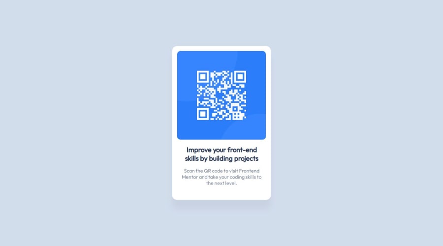
Design comparison
SolutionDesign
Solution retrospective
What are you most proud of, and what would you do differently next time?
It is a very simple start up project. Nevertheless, I have learned to add some tools (color picker, measurement devices, figma, chrome dev tools) to my workflow.
What challenges did you encounter, and how did you overcome them?Understanding the different possibilities to center content based on different display options was the most difficult part of the lessen. YouTube and stackoverflow helped a lot understanding the options better.
What specific areas of your project would you like help with?If somebody is reviewing this submit, I would be happy if you can help me with the following questions:
- Is my solution for centering the content a resilient solution? If not: Can you suggest me a better solution?
- Which approaches did you use to analyze existing web layouts when you did not have a figma file or something similar? Only visual comparison or can you suggest additional tools (e.g. to get the font family)? Especially when the chrome dev tools did not work because the content is hided behind js scripts.
Community feedback
- @DarkstarXDDPosted 7 months ago
- Remove the absolute positioning you have done. It's not a good way to center elements. Instead, give your
<body>
amin-height
of 100vh. Then useflexbox
orgrid
on the body to center the child elements. In this example I have usedflexbox
.
body { min-height: 100vh; display: flex; justify-content: center; align-items: center; }
- When defining the width of your container (your card in this case) use
max-width
instead ofwidth
. This allows the card/container to be responsive in smaller screen sizes. - Remove the
height
on your card. Never setheight
value for containers. Let the content inside the container decide the height of the container. - There is no need to use line breaks (
<br>
) everywhere like you have done. You don't need to specify where the sentences break. What you should do is give amax-width
property to your container and then give margin, padding and font-sizes as you need. Based on those values the browser will determine where the sentences will break. So remove all the<br>
tags you have. - Remove your
<div.content>
. It's not needed. Having the<div.card>
is enough. However you should change the<div.card>
to a<main>
tag. So your code will look like this.
<body> <main class="card"> <div></div> </main> </body>
<main>
is called a landmark element. Other types of landmark elements would be<header>
and<footer>
. But they are not needed for this project. However there should always be one<main>
element in your webpage. You can read more about it here- You can give a bit more descriptive alt text for the qr code image. I would suggest something like "qr code leads to frontendmentor.io"
- No need to have a bold tag
<b>
inside your<h1>
. You can remove that.
0 - Remove the absolute positioning you have done. It's not a good way to center elements. Instead, give your
Please log in to post a comment
Log in with GitHubJoin our Discord community
Join thousands of Frontend Mentor community members taking the challenges, sharing resources, helping each other, and chatting about all things front-end!
Join our Discord