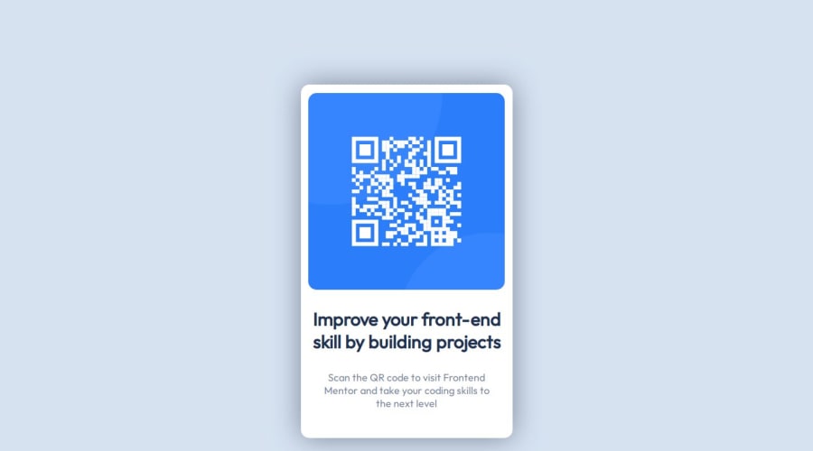
Design comparison
Solution retrospective
i'm just glad i could do it.
What challenges did you encounter, and how did you overcome them?- the qr image didn't fit into div but somehow i got it right. more or less
- div wasn't centered properly but somehow i got it right. more or less
- text an their padding was all over the place but somehow i got it right. more or less
looots of trial and error.
What specific areas of your project would you like help with?i don't have any specific questions, any feedback is welcome
Please log in to post a comment
Log in with GitHubCommunity feedback
- @adelayglesiafleitas
Hello @MrDull, good job, to center the module group it and apply margin: 0 auto in CSS. Set the side margins to "auto". Another thing you can do is use an external CSS and load it on your site, which makes it more readable when reading the code and it is very convenient to separate CSS from HTML:
Create a separate CSS file with your CSS code. For example, you can name it styles.css and save it in the same folder as your HTML file.
In the <head> of your HTML file, add a <link> tag with the following attributes:
<link rel="stylesheet" type="text/css" href="styles.css"> Where href is the relative path to the CSS file you created.By following these steps, you can load an external CSS file into your HTML document, separating the CSS from the HTML code for better organization and readability. Keep up the good work! Best regards.
Marked as helpful
Join our Discord community
Join thousands of Frontend Mentor community members taking the challenges, sharing resources, helping each other, and chatting about all things front-end!
Join our Discord
