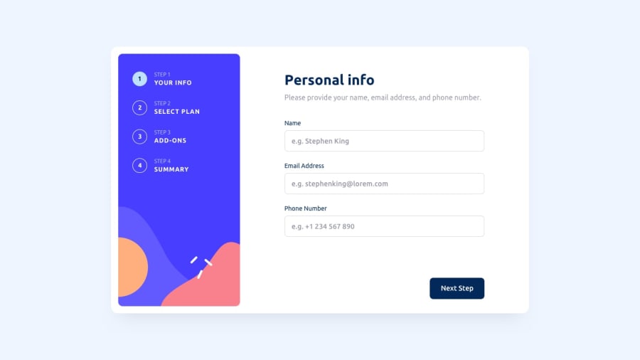
Design comparison
Solution retrospective
This project was a challange since I had trouble with many things I didn't expect. Adding the font was a problem by itself since there was a persistant fech error that didn't allow me to get the font. Somehow sill the font is a litthe different from the project.
Tailwind was complicated as it was my first contact. Not a major issue, but it took time for me to grasp it, especially regarding breakpoints. Also if someone can tell me if altering the styles using funcions is ok, I would appreciate the answer.
Forms were troubling to grasp, altough I had some knowledge, I insisted in the wrong path for some time intead of reviewing the basics.
The problems cited were great for me to understand more and made me more confident in my coding. Many aspects regarding best practices still remain, especially the conditional styling used. Altough there is still need for more refactoring, I think I have enough to submit the solution.
I am happy to have finished this, and expect the next challange to be easier because of what I learned here.
Community feedback
- @seanhillwebPosted about 1 year ago
Great job! For your first Tailwind project, I think you have a good grasp of its capabilities. You mentioned in your comment about using functions for styling - are you referring to using media breakpoints?
Tailwind has pretty good documentation about breakpoints and screen sizes, you can find that here:
- https://tailwindcss.com/docs/responsive-design
- https://tailwindcss.com/docs/screens
Keep going! I think you have a solid understanding already.
0
Please log in to post a comment
Log in with GitHubJoin our Discord community
Join thousands of Frontend Mentor community members taking the challenges, sharing resources, helping each other, and chatting about all things front-end!
Join our Discord
