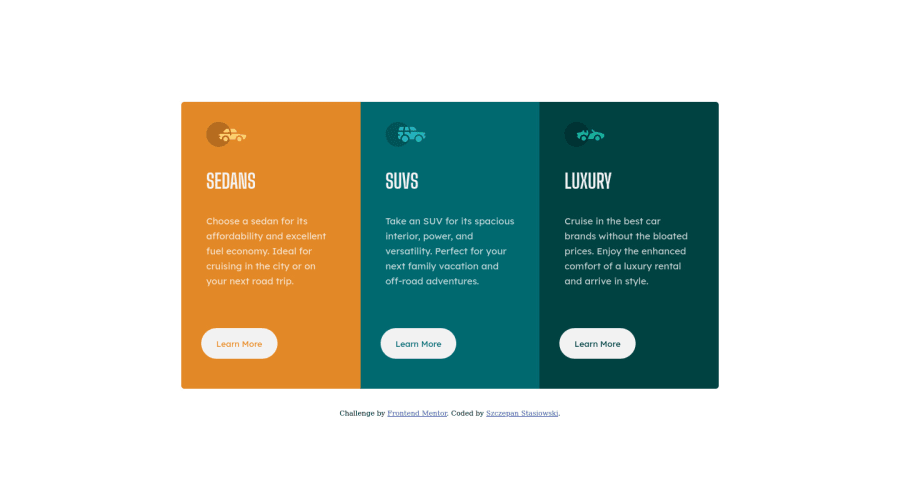
Design comparison
Solution retrospective
I've stucked with fonts and text formatting. Can't reach look even close to the design. Please review my code. I'm feeling newbie ;)
Community feedback
- @PhoenixDev22Posted over 2 years ago
Hello @bczbcz,
I have some suggestions regarding your solution:
-
There should be two landmark components as children of the body element - a
main
(which will be the component) and afooter
(which will be the attribution). -
For any decorative images, each img tag should have empty alt="" and aria-hidden="true" attributes to make all web assistive technologies such as screen reader ignore those images. In this case, all images are decorative only.
-
you can add a
<h1>
withclass="sr-only"
(Hidden visually, but present for assistive tech). and make the other heading tags to h2.
.sr-only { border: 0 !important; clip: rect(1px, 1px, 1px, 1px) !important; -webkit-clip-path: inset(50%) !important; clip-path: inset(50%) !important; height: 1px !important; margin: -1px !important; overflow: hidden !important; padding: 0 !important; position: absolute !important; width: 1px !important; white-space: nowrap !important; }
- don't capitalise in html, let css text transform take care of that. Remember screen readers won't be able to Read capitalised text as they will often read them letter by letter thinking they are acronyms.
- swap the buttons for anchor tags. Clicking those
"learn more"
buttons would trigger navigation not do an action so button elements would not be right. And for future, it is essential if you include a button in a form element without specifying it's just a regular button, it defaults to a submit button., though, so it's a good idea to make a habit of specifying the type. - I recommend to set :
body{ min-height: 100vh;*using vh (viewport height) units to allow the body to set a minimum height value based upon the full height of the viewport. */ }
border-radius
andoverflow hidden
to the container that wraps the three cards.so you don't have to set it to individual corners.
Overall , your solution is good . Hopefully this feedback helps
Marked as helpful1@bczbczPosted over 2 years ago@PhoenixDev22 Thanks, it is awesome review. I know nothing about the accessibility a this point, so your's post it is a good starting point form me.
1 -
Please log in to post a comment
Log in with GitHubJoin our Discord community
Join thousands of Frontend Mentor community members taking the challenges, sharing resources, helping each other, and chatting about all things front-end!
Join our Discord