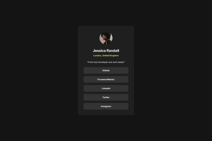
Design comparison
SolutionDesign
Solution retrospective
What are you most proud of, and what would you do differently next time?
I have learned how to use max height / width to restrict the container to grow is helpful in social card project
What specific areas of your project would you like help with?I need help with responsive layout, does this social links card need to grow when we increase view port and decrease / shrink when we reduce view port
Community feedback
Please log in to post a comment
Log in with GitHubJoin our Discord community
Join thousands of Frontend Mentor community members taking the challenges, sharing resources, helping each other, and chatting about all things front-end!
Join our Discord
