

Design comparison
SolutionDesign

Solution retrospective
What are you most proud of, and what would you do differently next time?
I am proud of how I made the site responsive.
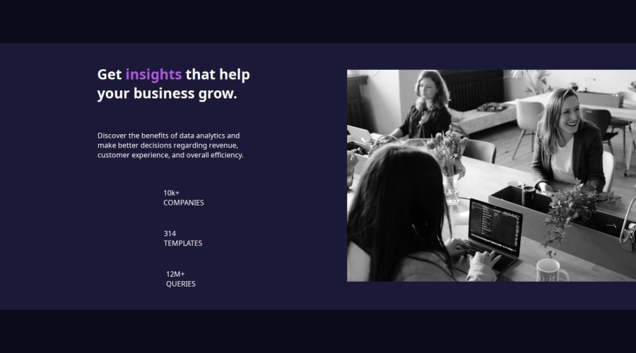
What challenges did you encounter, and how did you overcome them?I had trouble adding the color to the image.
What specific areas of your project would you like help with?I would like help with the image.
Community feedback
- P@ReiRevPosted 10 days ago
Nice work!
Your hero image is slightly different from the original. To match it more closely, try setting the image opacity to 75.11% and applying a multiply blend mode with the color #AB5CDB.
Here is my solution with tailwind.
      <div class="relative rounded-[8px] w-full h-[240px] xl:w-[540px] xl:h-[446px]">
        <picture>
          <source srcset="./images/image-header-desktop.jpg" media="(min-width:1024px)" />
          <img
            src="./images/image-header-mobile.jpg"
            alt="working engineers"
            class="w-full h-full object-cover absolute top-0 left-0 opacity-[75.11%] mix-blend-multiply xl:w-[540px] xl:h-[446px]"
          />
        </picture>
        <div
          class="w-full h-full bg-[#AB5CDB] -z-10 rounded-t-[8px] xl:rounded-tl-none xl:rounded-r-[8px] xl:w-[540px] xl:h-[446px]"
        ></div>
      </div>
0

Please log in to post a comment
Log in with GitHubJoin our Discord community
Join thousands of Frontend Mentor community members taking the challenges, sharing resources, helping each other, and chatting about all things front-end!
Join our Discord