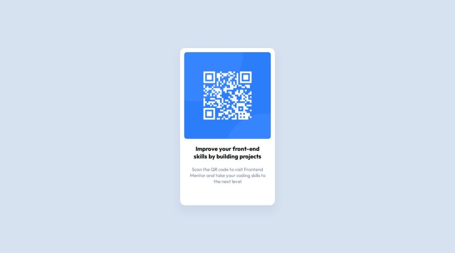
Design comparison
Solution retrospective
Hi there! While reviewing the "style-guide.md," I noticed the layout instructions provided are as follows:
## Layout

The designs were created to the following widths:

- Mobile: 375px
- Desktop: 1440px
However, the guide didn't specify the width for the qrcode component. I made a visual guess and set the qrcode component's width to 375px.
To create a clear separation between mobile and desktop widths, I researched online and implemented the following CSS code, intending to use 600px as the breakpoint:
@media screen and (max-width: 600px) {
  .qrcode-container {
    min-width: 375px;
  }
}
I'm not sure if this is what the instruction means. If anyone can tell me about that, I would be really grateful!
Community feedback
- @MelvinAguilarPosted about 1 year ago
Hello, the values of 375px and 1440px provided in the style-guide.md are simply the dimensions in which the design screenshots of the solution are presented. All challenges include images named "desktop-design.jpg" and "mobile-design.jpg," and these dimensions represent the size at which these screenshots were taken.
These values don't correspond to the width of the component or breakpoints; they serve merely as references.
In this particular challenge, since the mobile and desktop views are the same, you could potentially skip using a media query by directly applying
max-width: 300px;to the component. This simplifies your styles when dealing with a consistent design across different screen sizes.Marked as helpful4@SilentOw1Posted about 1 year agoHi @MelvinAguilar ,
Thank you for your reply!
This is my first project on Frontend Mentor, and I was a bit confused while looking at those instructions. I appreciate your clear explanation! :)
0
Please log in to post a comment
Log in with GitHubJoin our Discord community
Join thousands of Frontend Mentor community members taking the challenges, sharing resources, helping each other, and chatting about all things front-end!
Join our Discord
