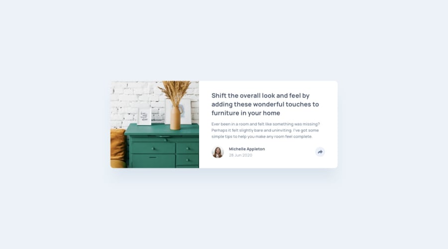
Design comparison
Solution retrospective
Please give feedback on my work. What can be improved?
Community feedback
- @DrKlonkPosted over 3 years ago
Looks good overall!
In the share button I see some room for improvement.
It would be nice to have it disable if you click outside of it as well.
It is also a bit weird that on smaller screens it covers the name and date (but maybe that was in the design).
In the code it is not great to have it dependent on the color of the button. I would probably toggle a class (button.classList.toggle('active')) on the button on click and fix everything in the CSS based on if the button has that class or not.
You could select the icon-social element in CSS with the "~" selector I think.
Also, it looks like you are tyring to use BEM for naming classes, but it's not consistent. If
title__contentis an element of the content block, it should becontent__title. After that you also use contact-user and userInfo, which are a bit ambiguous and use a different structure (hyphen and camelCase). Naming classes can definitely be tough, but can lead to much easier to read code. So it's well worth looking into! It's one of my own points of improvement as well.Cheers, Joran
Marked as helpful1
Please log in to post a comment
Log in with GitHubJoin our Discord community
Join thousands of Frontend Mentor community members taking the challenges, sharing resources, helping each other, and chatting about all things front-end!
Join our Discord
