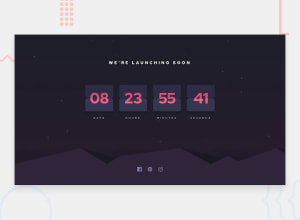
Design comparison
SolutionDesign
Solution retrospective
Any comments appreciable
Community feedback
- @MojtabaMosaviPosted almost 3 years ago
-
It would've looked better with original background-color, totatly respect your choci (just a suggestion).
-
Add hover state to the soical icon, a minimal hover state would be a subtle change in size, something like
.icon:hover{ transform:scale(1.1) }- "class="top-text"" would be better semantically as a h1 than p element since it explains the whole function of the UI.
Keep coding :=)
Marked as helpful0@Naresh1310Posted almost 3 years ago@MojtabaMosavi thankyou for your reply bro. It means a lot I will rectify the errors
0 -
Please log in to post a comment
Log in with GitHubJoin our Discord community
Join thousands of Frontend Mentor community members taking the challenges, sharing resources, helping each other, and chatting about all things front-end!
Join our Discord
