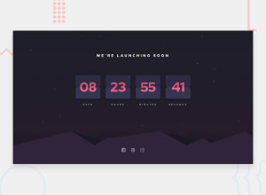
Design comparison
SolutionDesign
Solution retrospective
I tried hard to make the solution be similar to the design, but i faced some obstacles especially in mobile screen size. anyway, if you have any notes to make it look better.
Community feedback
Please log in to post a comment
Log in with GitHubJoin our Discord community
Join thousands of Frontend Mentor community members taking the challenges, sharing resources, helping each other, and chatting about all things front-end!
Join our Discord
