Submitted 11 months ago
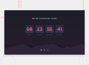
Launch countdown timer with flipping animation
#animation#sass/scss
P
@miranlegin
Design comparison
SolutionDesign
Solution retrospective
What are you most proud of, and what would you do differently next time?
I'm happy with how the flipping animation looks and numbers change. Easing could be better thought.
What challenges did you encounter, and how did you overcome them?The biggest challenge was to find the exact time when the flipping should occur.
What specific areas of your project would you like help with?I would love to see other approaches how to handle timing for flipping animation. I'm sure there are better ways to achieve this.
Please log in to post a comment
Log in with GitHubCommunity feedback
No feedback yet. Be the first to give feedback on Miran Legin's solution.
Join our Discord community
Join thousands of Frontend Mentor community members taking the challenges, sharing resources, helping each other, and chatting about all things front-end!
Join our Discord
