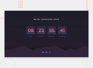
Design comparison
Solution retrospective
This was hard. What do you think?
Community feedback
- @Rosi-TPosted about 3 years ago
This is literally the best looking counter i've seen so far. The flip animations is also the best i've seen. So if you fix your background images, you will easily have the best solution! Here is a screenshot of how the background looks on my 17" screen: https://prnt.sc/1vraew8
I would put the hills as background to the footer section you got and set them to background-size: contain; And the stars as background to the body section and set them to background-size: cover;
Thank you for making this, it's truly amazing!
Marked as helpful0@exenestecnicoPosted about 3 years ago@Rosi-T Thanks for giving feedback. I hadn't noticed the background issue. Can you please check again to see if is fixed? I use a 14" laptop and not shure if fixed. Also if is not too much to ask can you open it in your phone to see if its all right?
Did you look at the code? What do you think about how its made?
0@Rosi-TPosted about 3 years ago@exenestecnico yes, backgrounds are good now. I opened the page on my phone and it seems fine on it too. I can't really comment on the code, as i am not an expert. The CSS seems in order and clean. It is weird for me to have the CSS for the flipping cards in the JS file, but as i said, i am not an expert.
And one last thing - your counter resets on page refresh, but i have no idea how would you fix that, as i suck at JS. I used this one for my attempt so i hope you would find it helpful: https://www.w3schools.com/howto/howto_js_countdown.asp
0
Please log in to post a comment
Log in with GitHubJoin our Discord community
Join thousands of Frontend Mentor community members taking the challenges, sharing resources, helping each other, and chatting about all things front-end!
Join our Discord
