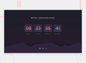
Design comparison
Community feedback
- @grace-snowPosted almost 4 years ago
Hey, well done on this! It's not an easy challenge and you've clearly had a good go at the card flip animation!
Only a few suggestions from me for improvements:
-
Your numbers can't be h2s. They are changing dynamically which is a problem for the accessibility tree - assistive technology will read out all h2s on the page, so it needs to be static content. I would just have them in a span inside an outer HTML block.
-
On mid-sized screens the cards go quite small and very far apart because you're using
justify-content: space-between;. instead, I suggest you set that to center and use thegapproperty to give the cards some space between.
Hope that helps :)
2@grace-snowPosted almost 4 years agoHere are some resources to help you refine the animation:
- https://codepen.io/annikakuelzer/pen/XWXVGGO
- https://codepen.io/shshaw/pen/vKzoLL
There are lots of examples out there, all a bit different to each other
1 -
- @joshysmartPosted almost 4 years ago
Thank you so much for taking the time to review my solution I learned a lot. I have refined the animation. I hope this is better?
0
Please log in to post a comment
Log in with GitHubJoin our Discord community
Join thousands of Frontend Mentor community members taking the challenges, sharing resources, helping each other, and chatting about all things front-end!
Join our Discord
