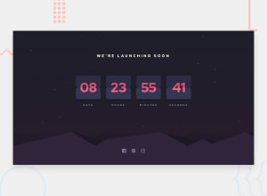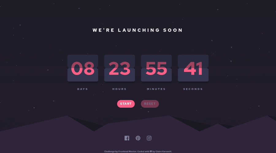
Launch Countdown Timer using Flexbox, Styled components, React, TS
Design comparison
Solution retrospective
Hello there,
This is my #8 challenge ๐ Is there anything I could optimize in my code? Any feedback is greatly appreciated ๐
I choose to do this project in TypeScript language and with the framework React to deepen my skills in these fields. This challenge also allowed me to deepen my knowledge of CSS for the layout part of this project.
Here are some example of my customization I added to this project:
โฏ๏ธ I decided to add a button to control the start of the countdown. This button can also pause the countdown. ๐ I also added a reset button. This button is available only when the countdown is running.
Thank you for reviewing my code, I am happy to hear any suggestions! ๐
Claire
Community feedback
- @KamQuossPosted almost 2 years ago
Hi Claire, nice work :) I've noticed that numbers aren't changing every second, but change is made every 2-4 seconds. Have You tried to count time with Date object and interval. Chcecking current time and calulating subtraction from "zero" every second (interval) could be more accurate. Hope this apprach would be interesting for You.
Marked as helpful0@ClaireKarsentiPosted almost 2 years ago@KamQuoss
Oops! Thanks for flagging this ๐ Considering this, I've just updated my code with a new useEffect for my useTimer hook:
useEffect(() => { const initialInterval: any = setInterval(() => { setTimeSpan((prevCount) => prevCount - SECOND); }, SECOND); if (!isStarted) { clearInterval(initialInterval); } if (timeSpan === 0) { setTimeIsUp(true); clearInterval(initialInterval); return; } return () => clearInterval(initialInterval); }, [timeSpan, isStarted, interval]);
Thank you ๐
0 - @Deevyn9Posted almost 2 years ago
Hi Claire, congrats on completing this project, it looks really great, I like your innovation to add the start and reset buttons. However, I noticed that from around 360px, the cards begin to overflow horizontally. look into making it responsive for screens of smaller width.
I hope you find this helpful and you're able to make it more responsive.
Happy Coding! ๐
Marked as helpful0@ClaireKarsentiPosted almost 2 years ago@Deevyn9
Thank you! I've just updated my code considering your feedback ๐
I need definitely to work more on responsive design on my next project ๐
1
Please log in to post a comment
Log in with GitHubJoin our Discord community
Join thousands of Frontend Mentor community members taking the challenges, sharing resources, helping each other, and chatting about all things front-end!
Join our Discord