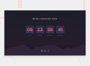
Design comparison
Solution retrospective
I am glad I got this project done the way I wanted to, as well as to be able to add one feature from myself other than mentioned in the challenge. I was ready to give this project more than A week but I am glad I got it done in less than that.
I think I need to improve my folder structure and the way that I write styles. I used SCSS in this project but I was mostly writing normal CSS in an SCSS file, so I will work on that.
What challenges did you encounter, and how did you overcome them?Well the biggest challenge for me and for all of us who are gonna take and have taken this challenge is getting that flip animation going. I spent so much time and energy just watching YouTube tutorials and making that flip animation work, however It was worth it in the end.
What specific areas of your project would you like help with?I am really struggling with responsive design with CSS GRID, I would appreciate feedback on that.
Community feedback
- @MaelkMarkPosted 3 months ago
This is cool, you did a great job! But I think you should restrict the hover styling for the buttons to only apply if they're not disabled. Because it's a bit strange and confusing that the cursor is
pointerand the buttons get bigger when they're disabled and don't do anything.Marked as helpful1
Please log in to post a comment
Log in with GitHubJoin our Discord community
Join thousands of Frontend Mentor community members taking the challenges, sharing resources, helping each other, and chatting about all things front-end!
Join our Discord
