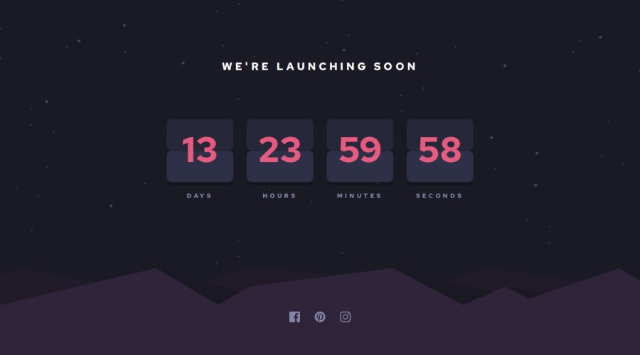
Design comparison
SolutionDesign
Solution retrospective
What are you most proud of, and what would you do differently next time?
I learned more about svgs, using the tag instead of wrapping it in an. More importantly I learned about how to create a timer using Javascript and output the results into the specified fields.
I was unable to do the bonus objective of animating the card. The only ways I could find to do this were to import a jquery file and use their code, but I didn't find one that allowed me enough control over the css to keep the style the same as the design.
What specific areas of your project would you like help with?How would the animated flip card come into play? Would it be created with JS or CSS?
Community feedback
Please log in to post a comment
Log in with GitHubJoin our Discord community
Join thousands of Frontend Mentor community members taking the challenges, sharing resources, helping each other, and chatting about all things front-end!
Join our Discord
