Design comparison
Solution retrospective
Feel free to give feedbacks.
Community feedback
- @yishak621Posted almost 2 years ago
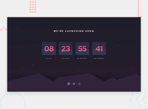
The numbers are designed in one wrapper for example ''55" just like these not "5""5" so it means they should be decreased or increased together like these "54" "53" so the flip animation belongs to both of the numbers not only to the single number on the right ...refer my solution it makes clear when u see that ...beside u did great job 👍👍
Marked as helpful1@aashabulPosted almost 2 years ago@yishak621 Oh now I understand. Yeah I did it separately because It was easy to handle single digits for me. But now I got your point. I will try to refactor. Thanks.
1 - @yishak621Posted almost 2 years ago
Good design loved it but a little bit of adjustment needed for the flip animation ...both numbers should be flipped not a single one since the design parent container is one wrapper for both numbers
0@aashabulPosted almost 2 years ago@yishak621 Hey, All the numbers are flipping. Can you describe it with few more lines? Maybe I don't understand your point.
1
Please log in to post a comment
Log in with GitHubJoin our Discord community
Join thousands of Frontend Mentor community members taking the challenges, sharing resources, helping each other, and chatting about all things front-end!
Join our Discord
