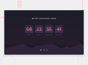
Launch Countdown, responsive design, animated, pure HTML/CSS/JS
Design comparison
Solution retrospective
This one was the hardest challenge yet, by far! It took me days of trying to wrap my head around trying to have both the boxes be responsive to different sizes when needed and have and animation that looked good at the same time. The final result is a page that adapts to (hopefully) any screen size small to extra-large and displays the 14 day countdown. Let me know what you think! I'm pretty proud of this one but I'm sure theres improvements to be made.
Community feedback
- @ARMANIE4LPosted 11 months ago
This is the best I've seen so far man, I just followed you. How can I reach you? I want us to learn together, or you be my mentor.
1@ClonephazePosted 11 months ago@ARMANIE4L Thank you very much! I was also happy with this one, though if I were to do it again I would probably handle it in a different way. I'm still learning everything myself but I appreciate the compliments. Definetly check out Kevin Powell on youtube, great resource for learning. Keep up the work!
1
Please log in to post a comment
Log in with GitHubJoin our Discord community
Join thousands of Frontend Mentor community members taking the challenges, sharing resources, helping each other, and chatting about all things front-end!
Join our Discord
