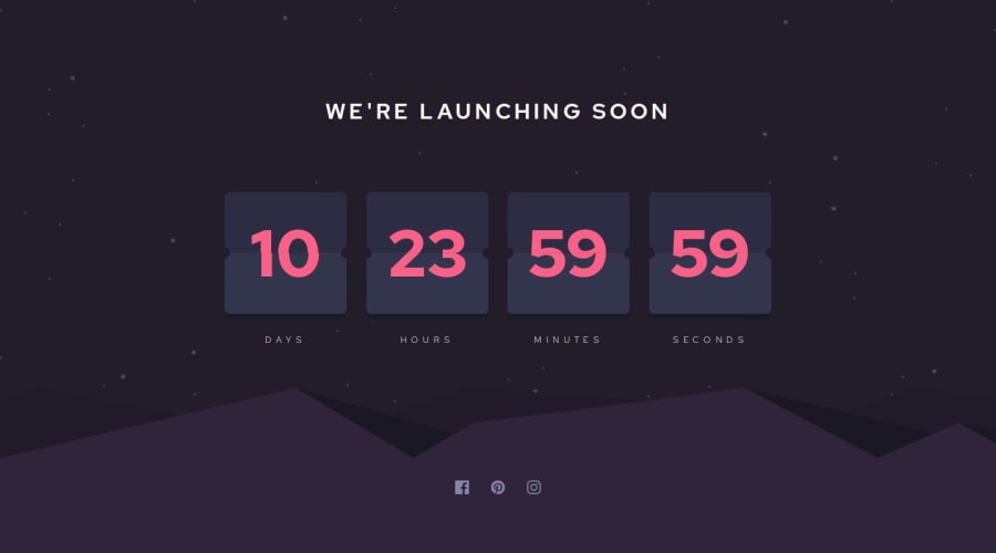
Launch Countdown done with NextJS (TS) and animation with pure css

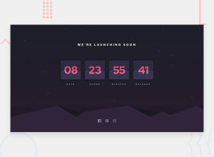
Design comparison

Solution retrospective
Using NextJS was an overkill for this challenge. But since I wanted to learn more about NextJS went ahead with it. If not would have gone for just React with Vite bundler without any framework like NextJS.
What challenges did you encounter, and how did you overcome them?The animation to do the flip was challenging, checked out some online resource on how to do it and implemented it in a way which I would easier to implement in react and less use of dom manipulation
What specific areas of your project would you like help with?I feel the animation can be better, maybe i need to use some external animation framework like Gsap but thought it would not be required for this challenge.
Would like to create a more realistic flip which flips the entire half of the container. The current implementation feels like only the number flips.
Community feedback
- P@kim-franssonPosted about 1 month ago
Hi! Nice work, really like the overall structure and look and feel. Here is some quick feedback.
Tips
Insted of creating two divs for the background images, you could stack images using the
backgroundproperty.html { background: url("./assets/images/pattern-hills.svg") bottom / contain no-repeat, url("./assets/images/bg-stars.svg") repeat, var(--very-dark-blue); }First background layer:
url("./assets/images/pattern-hills.svg")→ Sets an image as the background.bottom / contain→ Positions the image at the bottom and scales it to fit while maintaining its aspect ratio.no-repeat→ Ensures the image appears only once.Second background layer:
url("./assets/images/bg-stars.svg") repeat→ Uses another image that repeats across the entire background.Third background layer: var(--very-dark-blue) → Sets a solid color (--very-dark-blue) as the base layer.
Since CSS backgrounds stack, the solid color appears underneath, the stars repeat over it, and the hill pattern is placed on top at the bottom of the viewport.
Animation
This one may be a bit trickier and would probably break the current css. But you need to play around with
perspective,transform-style: preserve-3d;andbackface-visibility: hidden;.Here are an example of 3D like rotation. 100days CSS and the codepen. You may also need to play around with
perspective-origin.Fun personal touches
-
Try to add sound effects for the countdown, and maybe even some background music? When adding sound you will probably need to add a on/off toggle (a lot of browsers suppress sound before interacting with the site).
-
Try and animate the background stars, maybe add a small rotation, making it look like the "earth is rotating".
All the best, // Kim
Marked as helpful1@antojoy23Posted about 1 month ago@kim-fransson Thanks! Good to know about the background trick. Yes I haven't done much animations previously but that's something I want to get good at :) Thanks for the links, I'll check those out :D
Cheers
1 -

Please log in to post a comment
Log in with GitHub
Join our Discord community
Join thousands of Frontend Mentor community members taking the challenges, sharing resources, helping each other, and chatting about all things front-end!
Join our Discord