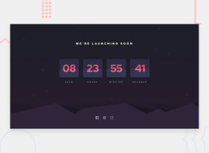
Design comparison
Solution retrospective
It was a really interesting challenge, any comments on the tricks to flip the card are appreciated ! One tricky thing to do was the "reverse" border radius in the middle of each counter. I tried by using clipping, but it never gave me the result I wanted. So I ended with that trick with multiple backgrounds and radial gradients. Don't know if that solution is the best one. Thanks !
Community feedback
- @GiancarloGFPosted over 3 years ago
Hi, Great Work! I am just going to start the challenge and I think the most interesting thing In this is that effect of change of card. I want to know how you achieve this or the resources that you have found to make this effect. Take care!
0@jonaguyoPosted over 3 years ago@GiancarloGF Hi, thanks.
For the flip effect of the cards, I just overlaid some div, and make the one on the top rotate around the X axis when the number have to change. I don't used any additional library for that challenge. Only SASS for the CSS.
If you find a good or better solution for the "reverse" border radius in the middle of each card, do not hesitate to tell me, I'm curious ^^
1
Please log in to post a comment
Log in with GitHubJoin our Discord community
Join thousands of Frontend Mentor community members taking the challenges, sharing resources, helping each other, and chatting about all things front-end!
Join our Discord
