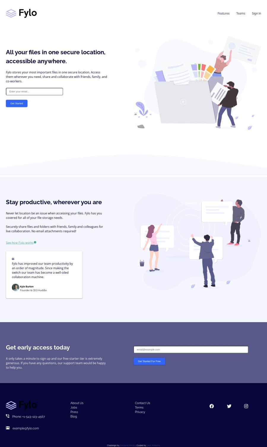
Design comparison
Solution retrospective
Had some issues with this submission that are still unresolved.
- One was the background curve, there's a gap between the image and the div for the next section
- Another was placement for the error messages, they looked fine in desktop but in mobile view the error message for the get started section is behind the input field
Community feedback
- @aymene91Posted almost 2 years ago
Hello there 👋.** Congratulations on successfully completing the challenge! **🎉
The code looks pretty clean and well structured. I would recommend that you update the Readme.md file by using the ReameTemplate.md file to make the repo more engaging. Other than that I find your solution pretty amazing keep grinding
If you have any questions, you can always check out my submission and/or feel free to reach out to me
I hope you find this helpful 😄 happy coding!
0
Please log in to post a comment
Log in with GitHubJoin our Discord community
Join thousands of Frontend Mentor community members taking the challenges, sharing resources, helping each other, and chatting about all things front-end!
Join our Discord
