Not Found
Not Found
Not Found
Not Found
Not Found
Not Found
Not Found
Not Found
Not Found
Not Found
Not Found
Not Found
Not Found
Not Found
Not Found
Not Found
Not Found
Not Found
Not Found
Not Found

Submitted

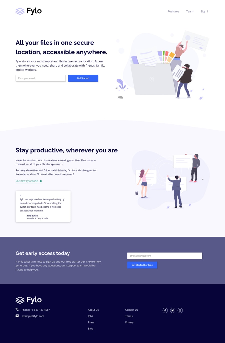
Landing Page with Two Column Layout Built Using CSS Grid & Flexbox

arey 350

@arey-dev

Desktop design screenshot for the Fylo landing page with two column layout coding challenge

This is a solution for...

  • HTML
  • CSS
2junior
View challenge

Design comparison


SolutionDesign

Solution retrospective


Feedbacks and tips will be greatly appreciated! Thanks!

Community feedback

PhoenixDev22 16,950

@PhoenixDev22

Posted

Hi arey,

Congratulation on finishing this challenge. Great job on this one! I have few suggestions regarding your solution:

HTML

  • Forms with proper inputs and labels are much easier for people to use. To pair the label and input, one way is an explicit label’s for attribute value must match its input’s id value. Input fields without accompanying labels can lead to accessibility issues for those who rely on screen readers. If a screen reader comes across an input field without a label it will try to find some accompanying text to use as the label. (To hide the label visually but present for assistive technology, you may use sr-only class ).
  • Never use <div> and <span> alone to wrap a meaningful content. Just keep in mind that you should usually use semantic HTML in place of the div tag unless none of them (the semantic tags) really match the content to group together like for .name .title.
  • Instead of using a generic div to wrap the social links class= social-link , you put your links within an unordered list structure so that a screen reader will read out how many things are in the list to give visually impaired users the most information possible about the contents of the navigation.
  • You need to manually add an aria-hidden attribute to each of your icons.

Aside these, you did great work. Hopefully this feedback helps.

Marked as helpful

1

arey 350

@arey-dev

Posted

@PhoenixDev22 Thank you for pointing out these things. Maybe I focused more on CSS and got careless on HTML. This feedback will truly help me when working on accessibility.

I'm gonna update my HTML after I rest, and I'll also make sure to expand my knowledge on accessibility and forms.

0
David 8,000

@DavidMorgade

Posted

Hello Arey, pretty good job with the responsiveness of your solution, it looks pretty good, congratulations

One thing that I would probably add is some transitions to your hover effects, it will make your page look more modern and smoother and its like a line or two of code for your buttons and links.

You could use ´transition: filter 0.5s ease´ for your buttons, and transition: color 0.5s ease

I would also like to say that you nailed with the html tags for your projects, maybe having your testimonial as an article would fit even more semantically.

Hope my feedback helps you!

Marked as helpful

0

arey 350

@arey-dev

Posted

@DavidMorgade Thank you!! I'm glad you reminded me about using article. I'll update it right away and add transitions in the process too.

1

Please log in to post a comment

Log in with GitHub
Discord logo

Join our Discord community

Join thousands of Frontend Mentor community members taking the challenges, sharing resources, helping each other, and chatting about all things front-end!

Join our Discord