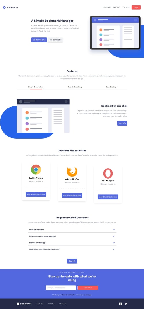
Submitted over 1 year agoA solution to the Bookmark landing page challenge
landing page with tailwind css
tailwind-css
@tortaruga

Solution retrospective
What are you most proud of, and what would you do differently next time?
i'm proud that i finally managed to finish it! and it doesn't look too bad! i feel like i climbed mount everest! i think the html is a bit messy though, and i think i could make the js more DRY, so next time i'd focus on that.
What challenges did you encounter, and how did you overcome them?i had trouble with tailwind at the start, but after spending so much time on this project i think I'm starting to get better.
What specific areas of your project would you like help with?any feedback is welcome
Code
Loading...
Please log in to post a comment
Log in with GitHubCommunity feedback
No feedback yet. Be the first to give feedback on tortaruga's solution.
Join our Discord community
Join thousands of Frontend Mentor community members taking the challenges, sharing resources, helping each other, and chatting about all things front-end!
Join our Discord