Landing Page With Responsive Margins/Padding And Gradient Animations
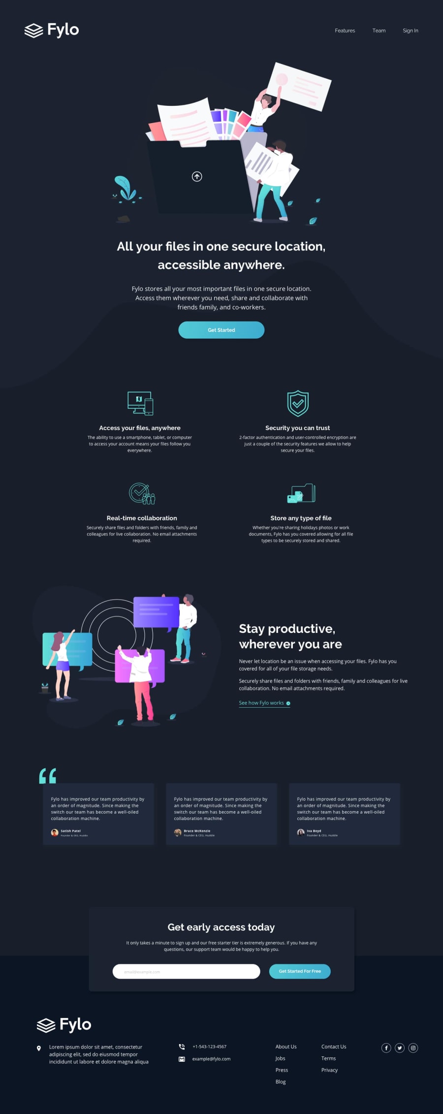
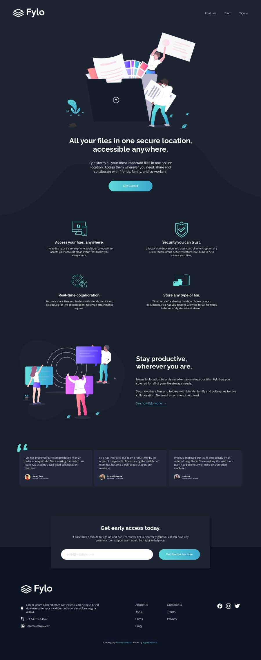
Design comparison
Solution retrospective
Hey, everybody!
This was an exciting challenge from which I learned a lot! π
I tried adding to the responsiveness of this site by setting many of the margins/paddings in percentages or vw
units and only using min-width
in my media queries (for my first time).
I also learned how to color the link text with a gradient (courtesy of the clip-path
property π) and made this subtle but awesome gradient-animation-hover-effect on the buttons using pseudo-elements! π
Feedback is definitely welcomed and appreciated!
(Also, if you would suggest any improvements to my actual code that would be cool).
Happy coding! π
Community feedback
- @Octagon-KingPosted over 3 years ago
Love How you have done this project but the only thing I'm stuck on is the dark background under the curve-bg image. I have tried many ways but couldn't make it to work. when resize it just goes up and doesn't stick under the curve-bg image. I don't know what I'm doing wrong. The only way I could have think that work will be media queries which I have to use for every px which gonna take a lot of queries.
1@ApplePieGiraffePosted over 3 years ago@Octagon-King
Hey, Octagon-King! I suggest trying to use CSS background images to add and position the curvy background in the hero section of this challenge. If you add it to the section containing the hero image and text, you can add
background-position: bottom
to make the background stick to the bottom of the section andbackground-size: cover
to ensure that it always covers the entire width of the screen. πHope that helps. π
(And let me know if you have any more questions.) π
0 - @mattstuddertPosted about 4 years ago
Love the extra details you've added on this challenge! π What would you say were your major learning outcomes from completing this project? How did you get on with using
min-width
instead ofmax-width
media queries?Your code looks good overall and your layout looks great on the responsive side of things. I'd recommend taking a look at the solution report and trying to clear up the accessibility errors.
Awesome work! π
1@ApplePieGiraffePosted about 4 years ago@mattstuddert
Thank you very much!
Using
min-width
rathermax-width
really helped me think about how my page would look on a smaller screen before I got to thinking about the desktop layoutβwhich was good for a change for me. I'd say this project most helped me learn about making my sites look better on more screen sizes in neater, more concise code. πI'll do as you suggested and take a look at the solution report and try to clear it up (something I sometimes forget to do). π
1@mattstuddertPosted about 4 years ago@ApplePieGiraffe awesome, yeah that's one of the things I like about working mobile-first as well. Looking forward to seeing your next one!
0
Please log in to post a comment
Log in with GitHubJoin our Discord community
Join thousands of Frontend Mentor community members taking the challenges, sharing resources, helping each other, and chatting about all things front-end!
Join our Discord