Design comparison
SolutionDesign
Solution retrospective
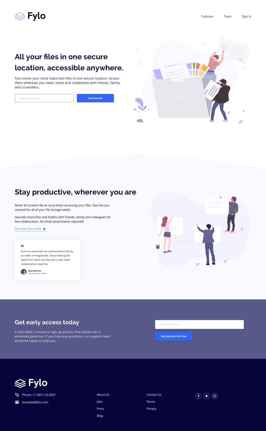
They are free to comment, it is my first landing page and I would like to know your opinion
Community feedback
- @DarknessflowersPosted over 4 years ago
Nice job! A few things to look at fixing: on mobile the logo is stretched because of the exact widths it has been told to go to. For some reason the 'See how Fylo works' link isn't using the font. Menu colour is different from in the design. You've misspellted alt as atl multiple too, but that's an easy fix.
It's really good for your first landing page. I hope you do more!
0
Please log in to post a comment
Log in with GitHubJoin our Discord community
Join thousands of Frontend Mentor community members taking the challenges, sharing resources, helping each other, and chatting about all things front-end!
Join our Discord
