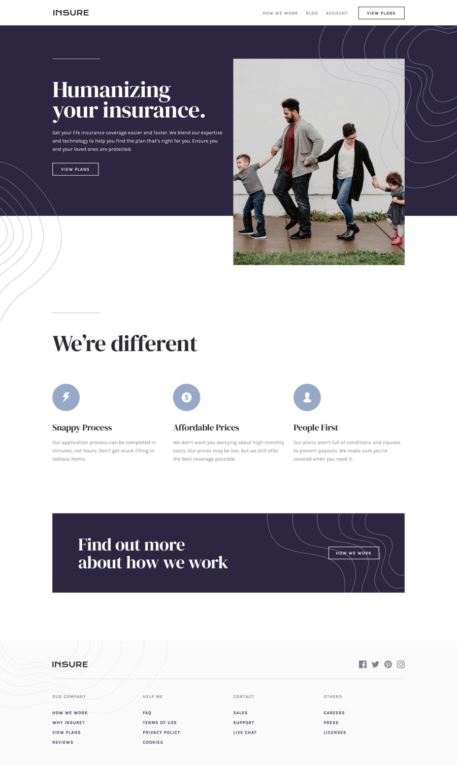
Design comparison
Solution retrospective
Any suggestion to improve would be great! 😁
Community feedback
- @brasspetalsPosted almost 4 years ago
Hi, Filip! 👋
Congrats on completing your first full-page challenge! Overall it responds well, and I have a few suggestions to make it even better:
-
The font-family for your headings should all be the same - here your h1 is correct, but the h2’s and h3’s are not.
-
Adding hover and focus states to your links would be a nice touch.
-
For accessibility, I highly suggest using a
buttonfor mobile menu button. -
The benefits text gets very stretched on medium layouts, so consider adding a max-width to these.
-
The curvy images for the mobile menu, banner, and footer would be better set as background images, and positioned with
background-positionas well asbackground-sizeif needed. -
The “how we work” link in the banner needs
text-transform: uppercase -
The font of the links in your footer is too large, and I also suggest using unordered lists for the link groups, with the links inside list items. Another note here is that your
.headersshould not be links as they are just titles for the link groups.
Happy coding!
1 -
Please log in to post a comment
Log in with GitHubJoin our Discord community
Join thousands of Frontend Mentor community members taking the challenges, sharing resources, helping each other, and chatting about all things front-end!
Join our Discord
