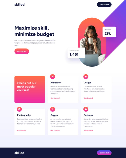
Submitted almost 3 years agoA solution to the Skilled e-learning landing page challenge
Landing page [with custom properties][wrapper with padding trick]
@OignonFugace

Solution retrospective
Hi everyone!
I am continuing my exploration of newbies challenges. This one allowed me to discover more about linear gradients, use custom properties, and test a particular layout system.
More context on the github repo.
My questions are:
- Was there a more straightforward way of positioning hero images while keeping them in the markup? I feel that my solution is a little far fetched.
- I have the feeling that the way I did the layout (namely site wrapping with calculated paddings on each section) isn't appropriate for bigger projects. However, it was needed here in order to set the background linear gradient not on the body but on the courses-section only. How could I have acheived that differently, with a more suitable layout system?
- Any other feedback is greatly appreciated!
Thank you, have a good day!
Code
Loading...
Please log in to post a comment
Log in with GitHubCommunity feedback
No feedback yet. Be the first to give feedback on Tanguy's solution.
Join our Discord community
Join thousands of Frontend Mentor community members taking the challenges, sharing resources, helping each other, and chatting about all things front-end!
Join our Discord