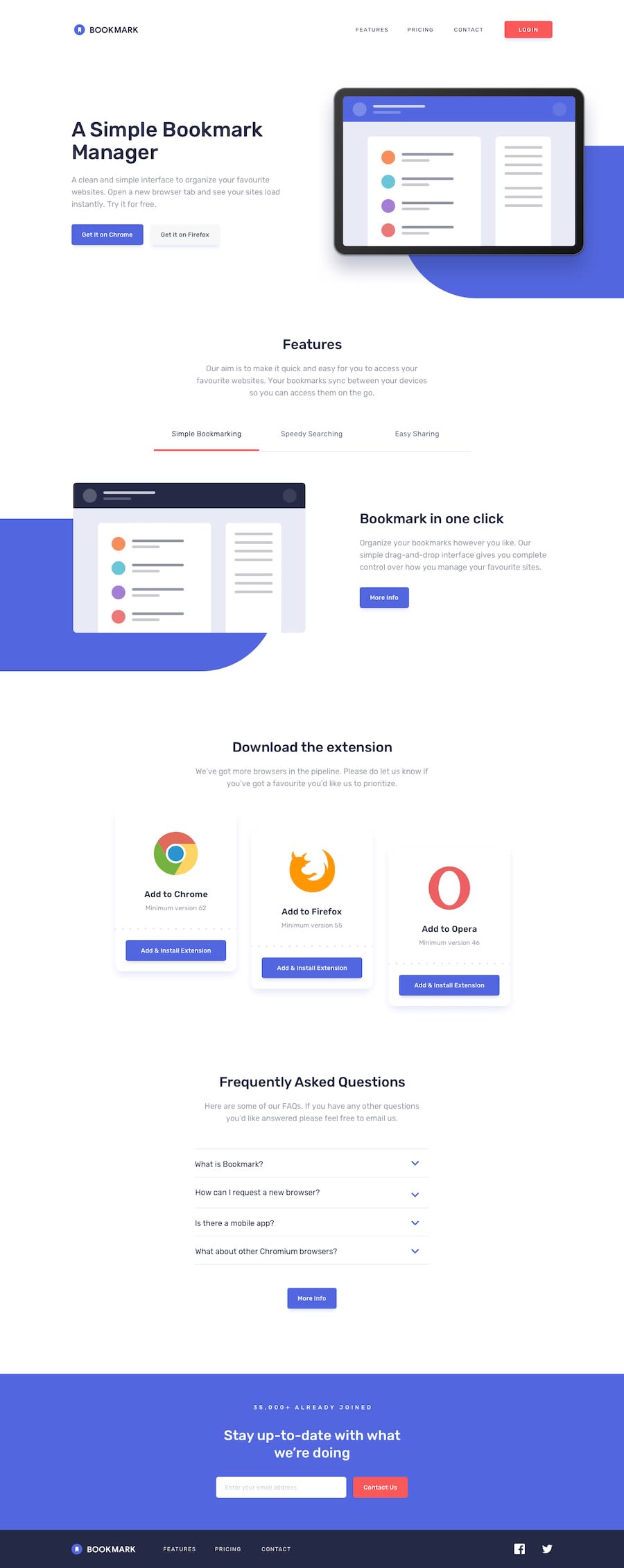
Design comparison
Solution retrospective
I'll be honest, I just gave up on this one. It's not bad, but it's not my best.
Community feedback
- @HamzaouladevPosted over 1 year ago
hello @partum! this project is long and challenging but youre doing great! just keep going at it by breaking it down into smaller problems and fixing those one at the time, dont worry about time for now and use this as practice for the multitude of problems that youll have to solve daily as a developer .
heres some feedback i think youll find interesting:
-in the FAQ section there are built in html tags that will save you the trouble of creating the accordion functionality:
<details>and<summary>, you just need to style them.. read this documentation for more info.-i would really recommend writing vanilla css and not relying on utility class based approach or any css framework until you have a solid understanding of css architecture.
-in your container tags make sure to add a relative width:
width: 90%;for example on top of themax-width, its a simple but really effective hack for responsiveness-another simple hack with images is to add the following code so they wont overflow:
img,
picture {
  max-width: 100%;
  display: block;
}
-also dont forget about adding an alt description to your images as it is very important for your site's accesibility.
i hope you find my feedback helpful, KEEP HACKING!
1 - @0xabdulkhaliqPosted over 1 year ago
Hello there 👋. Congratulations on successfully completing the challenge! 🎉
- I have other recommendations regarding your code that I believe will be of great interest to you.
HTML 🏷️:
- This solution generates accessibility error reports due to incorrect usage of
semanticmarkup, which confueses the landmark for a webpage
- So fix it by wrapping those
<section>elements the with semantic element<main>along with<div class="attribution">the with semantic element<footer>in yourindex.htmlfile to improve accessibility and organization of your page.
- What is meant by landmark ?, They used to define major sections of your page instead of relying on generic elements like
<div>or<span>
- They convey the structure of your page. For example, the
<main>element should include all content directly related to the page's main idea, so there should only be one per page
I hope you find this helpful 😄 Above all, the solution you submitted is great !
Happy coding!
0
Please log in to post a comment
Log in with GitHubJoin our Discord community
Join thousands of Frontend Mentor community members taking the challenges, sharing resources, helping each other, and chatting about all things front-end!
Join our Discord
