Design comparison
Solution retrospective
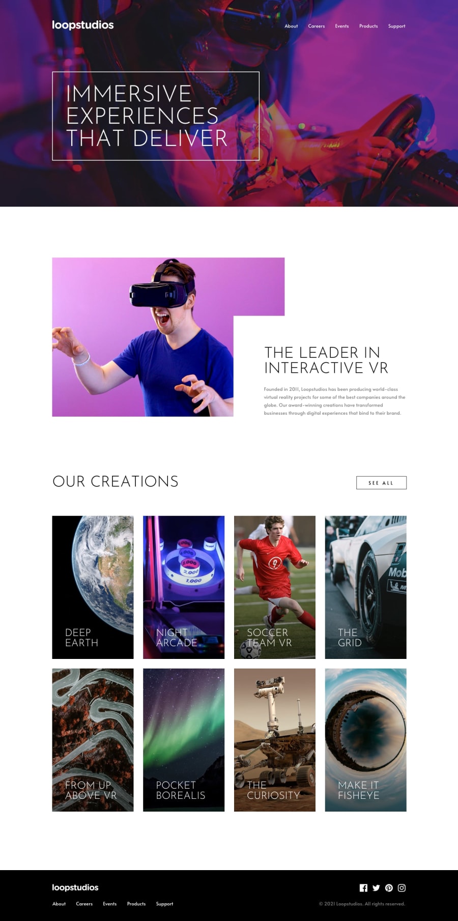
it looks good enough, but next time i'd try making it look better on medium sized screens and I just noticed the hero image should be darker, i forgot to add that
What challenges did you encounter, and how did you overcome them?had some issues setting up sass and then with the layout as always, but after trying fifteen thousand times everything worked.
also, on my screen it doesnt look like in the design comparison, not sure what's up about that
What specific areas of your project would you like help with?all feedback's welcome
Community feedback
- @jjdavenportPosted 5 months ago
The basic layout of the site is correct, on the desktop layout the large areas of blank space are likely caused by min-height: 100vh. However the mobile layout is spot on. The hover effects are not quite identical to the solution with the borders on hover being 100% instead of 50% of the element width, I also have a wierd bug on 1440p where I can only see half of the h1. The page could be made more accesible with semantic html elements used on the mobile menu, I would also disable scroll when the mobile menu is active with js. The desktop site needs more work to make is responsive on the viewports its designed for.
Marked as helpful0@tortarugaPosted 5 months agoThank you @jjdavenport, that was really helpful! For the hover effect being 100% of the width it was because I thought the solution meant it had to 'expand' from the center when you hover it and gradually underline the whole word, but I think I just made it unnecessarily more complicated 😅
1
Please log in to post a comment
Log in with GitHubJoin our Discord community
Join thousands of Frontend Mentor community members taking the challenges, sharing resources, helping each other, and chatting about all things front-end!
Join our Discord
