Landing page using vanilla CSS Grid + Flex / No frameworks


Design comparison

Solution retrospective
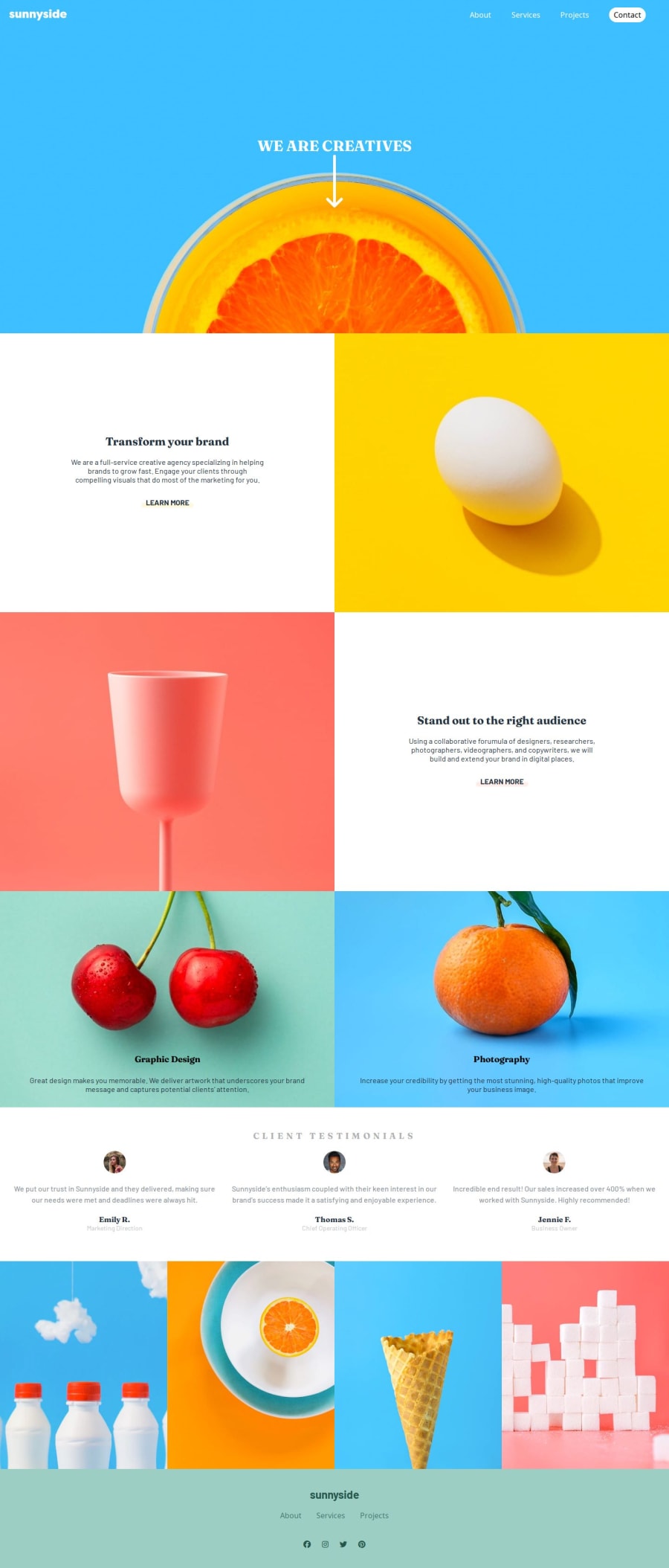
I am proud that I was able to get this layout to look good with the provided jpeg Design. It may not be exact with all the sizes, but I think it looks fine.
What challenges did you encounter, and how did you overcome them?I had a lot of challenges with getting the testimonial section to line up when the number of lines in a paragraph was more than the text beside it. E.G if Emily text was longer than Jonathan then Jonathan's name would appear higher than Emilies. I fixed this by making a bunch of divs and giving margin to the bottom of the client-description.
What specific areas of your project would you like help with?I don't like the way I did the header. I made it a div with a background of the image, and through a series of background image manipulation such as positioning the background on its Y axis I got it to appear almost how I wanted. I am not a fan of how much blue space I have between the nav bar and the orange. I got frustrated and gave up accepting the way it looks finally.
If you have any advice about positioning the image as a background and making it look nice that would be appreciated.
Community feedback
Please log in to post a comment
Log in with GitHubJoin our Discord community
Join thousands of Frontend Mentor community members taking the challenges, sharing resources, helping each other, and chatting about all things front-end!
Join our Discord