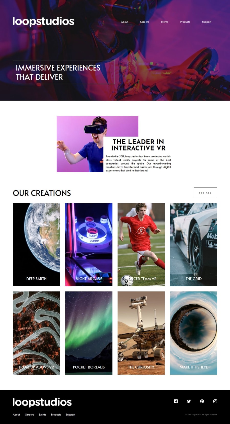
Design comparison
Solution retrospective
This project was the crux of what I have learnt in last 2 weeks
Making A page with basic sections like header and footer really helped me learn a lot
I used BEM methodology and CSS grids for my layout
What challenges did you encounter, and how did you overcome them?While making mobile design, I found it challenging to make the side navigation bar which would be used by the menu button
I managed to make it work by class toggling in js
What specific areas of your project would you like help with?It is my first time paging a page with proper header and footer
Any piece of advice is welcomed whether it is related to semantics, accessibility or code practice, I'm all ears
🥰
Community feedback
Please log in to post a comment
Log in with GitHubJoin our Discord community
Join thousands of Frontend Mentor community members taking the challenges, sharing resources, helping each other, and chatting about all things front-end!
Join our Discord
