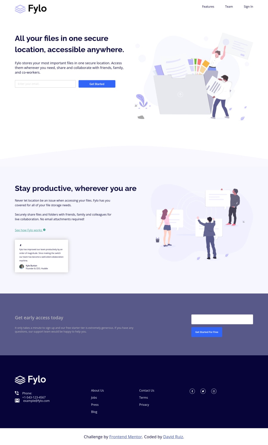
Design comparison
SolutionDesign
Solution retrospective
Any feedback is welcome!
Community feedback
- @vanzasetiaPosted over 2 years ago
Hello, CodingTube! 👋
First, we need to get the HTML right.
- The logo and the navigation links should live outside the
mainlandmark. It should live in theheaderlandmark. - It is not a best practice to have many
h1on a page. It can confuse the screenreader users because there will be many titles for a single page. I recommend reading the "How-to: Accessible heading structure - The A11Y Project" article to learn how to use headings correctly. - Use
buttonwithtype="submit"instead of<input type="submit">. Submit input is legacy. - Not every image needs alt text. If the image does not provide any meaningful content, such as illustrations, consider using empty alt text (
alt=””). This saves your screen reader users time as they navigate the page. - Put the
footeroutside themainlandmark. - The attribution should be on its own
footer. - Since there will be two
footer, you need to label eachfooterusingaria-labelledby. This way, the screenreader users can differentiate the landmarks.
<footer aria-labelledby="footer-site"> <p id="footer-site">Site</p> </footer> <footer aria-labelledby="frontendmentor-attribution"> <p id="frontendmentor-attribution">Frontend Mentor attribution</p> </footer>- The About Us, Jobs, Press, etc are links (not just plain text). The same goes for social media icons.
- Don't use inline styling. Put all the styling in the external stylesheet.
For the responsiveness of the site, there are things that need to be fixed.
- Don't limit the width of the
mainelement. The page should always have full width. I recommend taking a look at my solution to see how the responsiveness of the site should be done.
@media (min-width: 1440px) { .main-container { /* width: 1440px; */ /* height: unset; */ /* font-size: unset; */ } } .main-container { /* width: 375px; */ margin: 0 auto; }- Use
remor sometimesemunit instead ofpx. Usingpxwill not allow the users to control the size of the page based on their needs. I recommend reading this article aboutremandemunit. This article explains both units in a simple way. - There is no need to set
widthandheightfor most elements. In fact, you may not need any of them. The only thing that you need ismax-widthto limit the page elements so that they are not filling the entire widescreen. 1440pxfor the desktop layout is too late. I recommend adding media queries whenever it is needed such as when the layout starts breaking or when there is enough space for a two-column layout. It looks like the breakpoint is following the sizes on thestyle-guide.md.
That's it! I hope this helps! 🙂
0@vanzasetiaPosted over 2 years ago@CodinGitHub
I noticed that the code snippet for labeling the footer is not completed. We need to add
hiddenattribute to make it invisible visually but still accessible by screenreader users.<footer aria-labelledby="footer-site"> <p id="footer-site" hidden>Site</p> </footer> <footer aria-labelledby="frontendmentor-attribution"> <p id="frontendmentor-attribution" hidden>Frontend Mentor attribution</p> </footer>0 - The logo and the navigation links should live outside the
Please log in to post a comment
Log in with GitHubJoin our Discord community
Join thousands of Frontend Mentor community members taking the challenges, sharing resources, helping each other, and chatting about all things front-end!
Join our Discord
