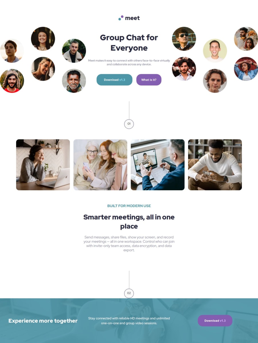
Design comparison
Solution retrospective
I liked that I got to use so many differnt grid and flex boxs and was able to overcome most of my challenges
What challenges did you encounter, and how did you overcome them?I have no idea how to create the little line and cirucular objects without using random div which worked but could probably have been done easier. I also didn't know how to position them a litte better. I also thought this project took me an extremely long time to finish (4hrs) way longer than other projects have.
What specific areas of your project would you like help with?I would love any feedback on the code it self. I know the solution won't be pixel perfect but i'm not super worried about that at this stage.
Join our Discord community
Join thousands of Frontend Mentor community members taking the challenges, sharing resources, helping each other, and chatting about all things front-end!
Join our Discord
