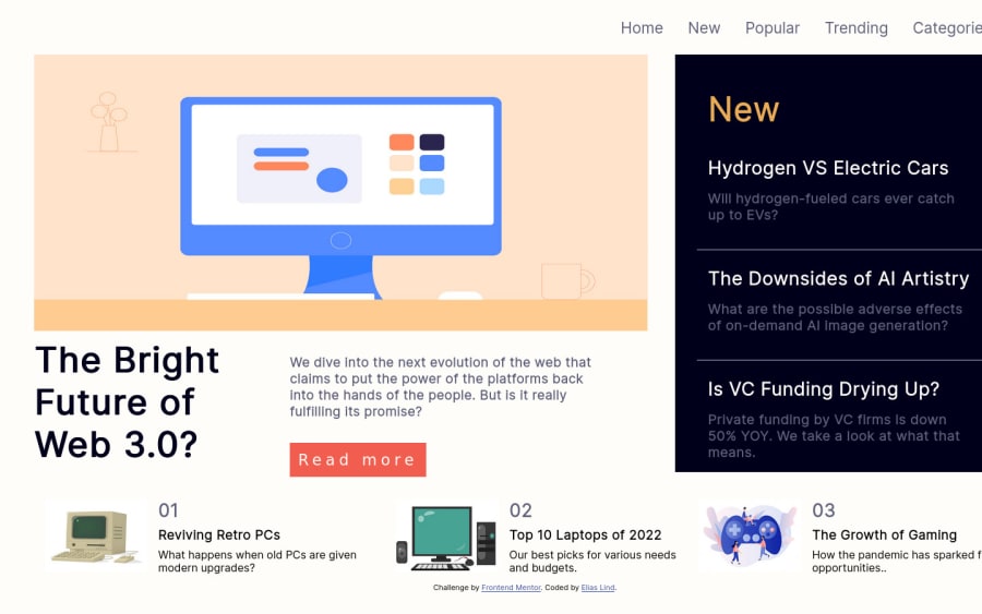
Landing Page using Mixture of Grid and Flex to layout elements


Design comparison

Solution retrospective
How would I change my current design to be responsive?
I used a mixture of grid and flex for my displays; is this frowned upon when developing a frontend page?
How long should the color pallet and layout planning period be when beginning a website from scratch?
Community feedback
- Account deleted
Firstly do not set an explicit width on the body. You should create a container that stores everything inside of it, and you can give it a max-width. That way it is flexible but will never grow past the maximum width you have set. As of now, your code is completely non responsive firstly because of using the fixed width on the body. Secondly you should start by designing the mobile view first. This is simple because everything just stacks on top of each other. You don't need CSS grid for Mobile. Once you have the mobile design looking perfect, expand the screen until the mobile design starts to look a bit weird, this will be your first media query. Place a media query for this screen size and change the design elements inside this media query until it looks good again. You already understand CSS Grid by the looks of it, so this should be easy to do. That's pretty much it, just try and avoid setting explicit widths on anything if you can, you want the content to be flexible, use max-width instead.
Marked as helpful1 - @JairthPosted over 2 years ago
Hello, I advise you to add semantics to your page. On the other hand, some people find it easier to start developing first for mobile and then for desktop, maybe that can help you.
You should also add break-point to make the respective changes between mobile and desktop. In my opinion, you can use Flex and Grid together, both are powerful tools.
Marked as helpful0@EL132Posted over 2 years ago@Jairth Thank you. I often forget about semantics or remember them midway through :/ Either way, I really appreciate your feedback!
0

Please log in to post a comment
Log in with GitHub
Join our Discord community
Join thousands of Frontend Mentor community members taking the challenges, sharing resources, helping each other, and chatting about all things front-end!
Join our Discord